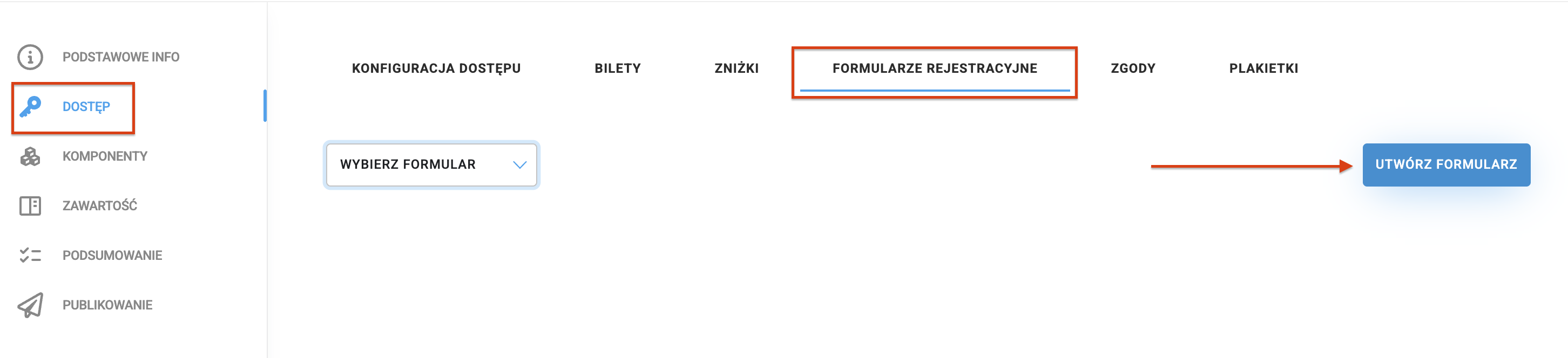
When selling tickets to an event, organizers collect contact details and additional information from participants. In the Create>Access section, there's a Registration Forms tab that allows you to create extra forms for collecting data from your attendees. After creating the forms, you can assign them to the appropriate tickets in the Tickets. For details on adding tickets, check out the article Tickets.
This module can be a powerful tool for collecting detailed info about your attendees. In the form, you can ask about diet preferences, t-shirt size, or which event attractions the participant is most interested in. With this setup, you can be sure you're gathering all the crucial information for event organization in one place.

To create a new form, go to the CREATE → ACCESS → REGISTRATION FORMS, and then click CREATE FORM
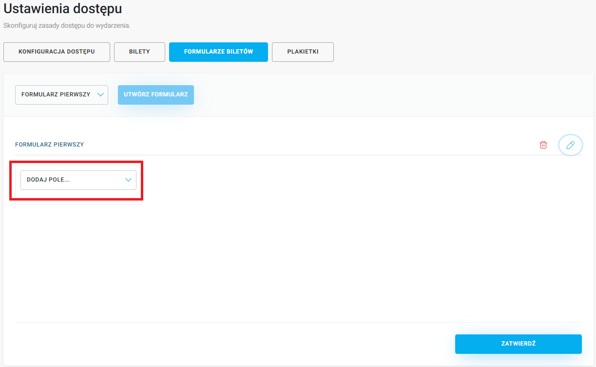
Want to edit a form you've already created? From the dropdown, pick the form you want to work on.

You can add several types of fields to the form. Click the Add field button, and then pick the field you're interested in from the list:
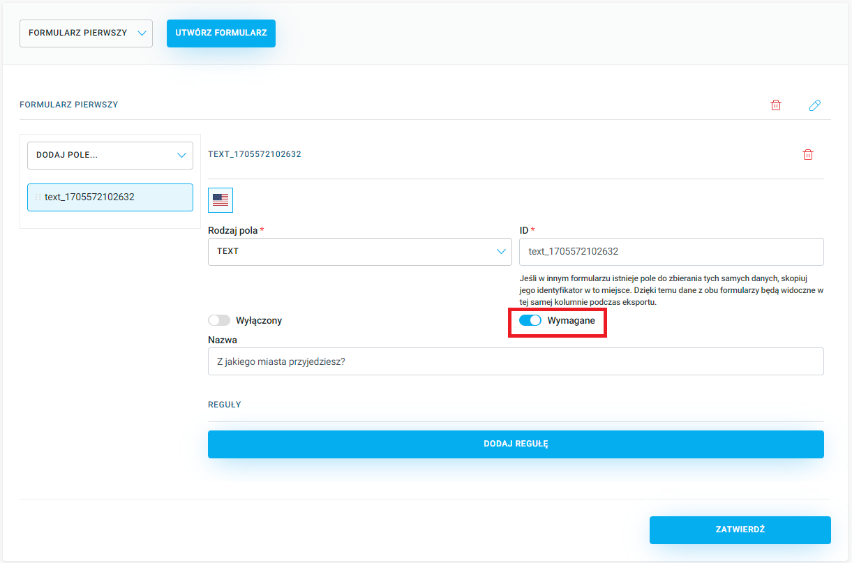
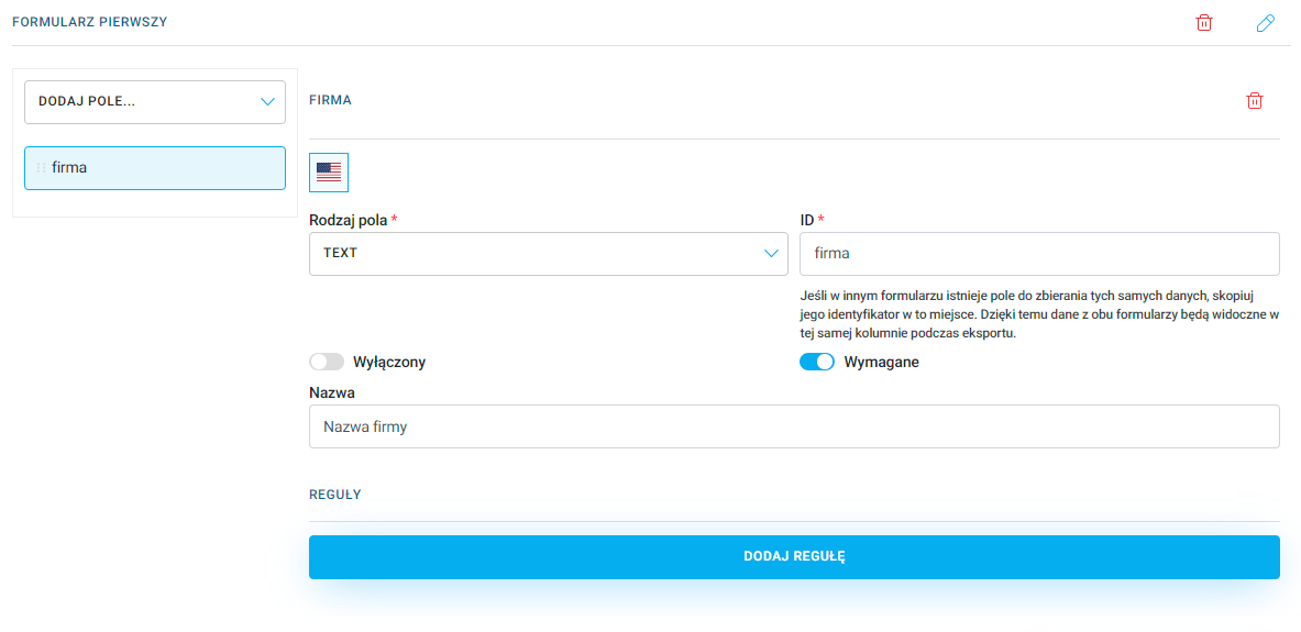
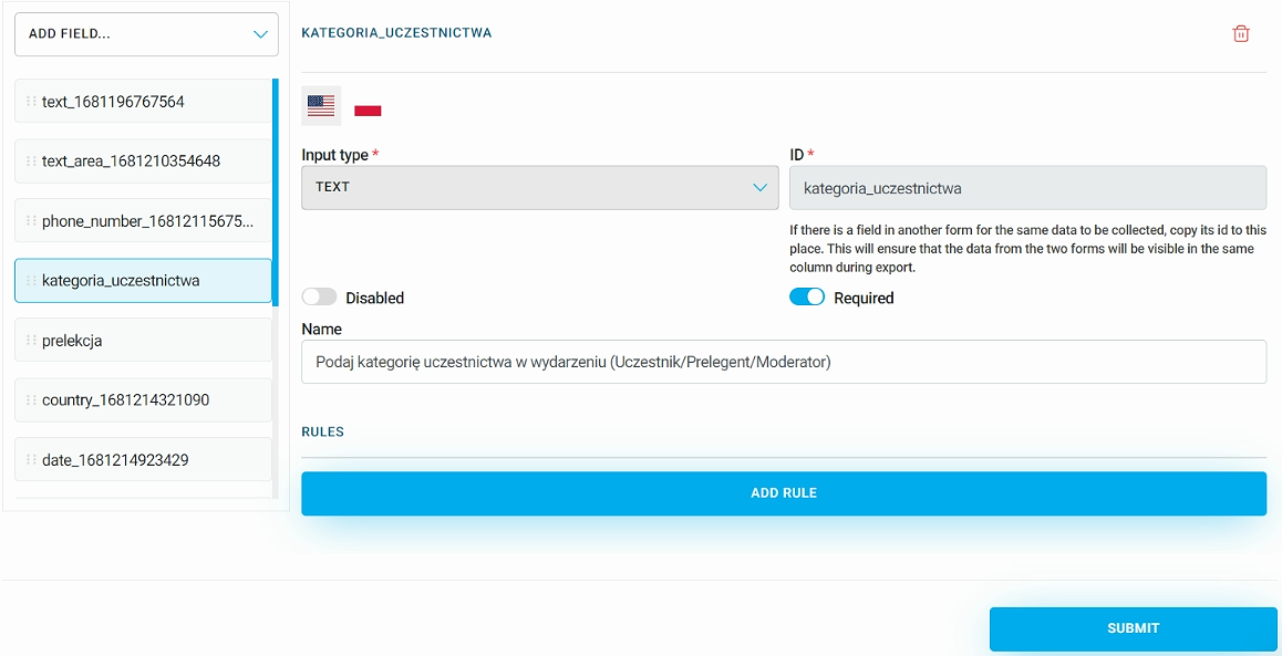
Once you select the field type, a section with details to fill in will appear. Each of them repeats three basic elements: Field type, ID, and Name.
Field type - specifies the type of field to fill in that will be added to the form. You can use this to change the type of an already added field. Descriptions of all available fields can be found later in this article.
ID - this is the individual name of the selected field, visible only in the admin panel. You can change this name to something that suits the content being collected when creating the form, e.g. in a text field it could be job_title or company_name. ID cannot contain spaces. If another form contains a field collecting the same data, copy its identifier here. This way, data from both forms will appear in the same column when exporting data from the Participants.
Name - this is the text visible to the user while filling in the form. The content of this label should be short and clear enough so the user knows what data to enter. In the case of the CHECKBOX and INFORMATION fields, the name will be the content for acceptance or the informational message.
When creating each form field, you can decide whether it is required or optional. To make a required field optional, move the Required slider to the left. This lets you buy a ticket without having to fill in the marked field:
When editing the form, you can decide to stop showing a specific field to participants by turning on the Disabled switch.
Info like First name, Last name and Email address is collected automatically by the system in the previous ticket purchase step. So we recommend not asking for it again in the form.
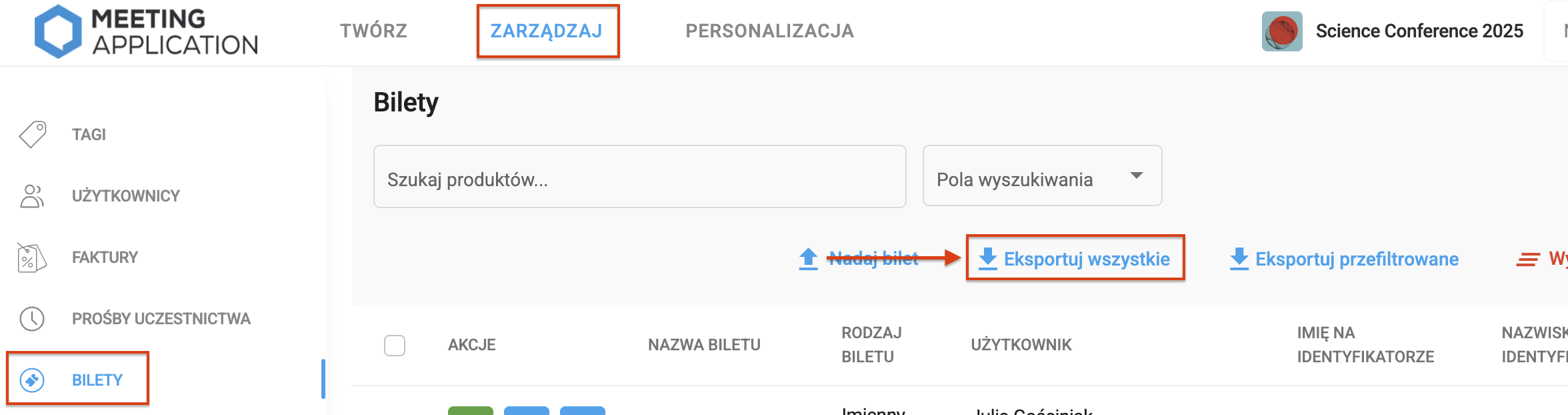
To download results from the forms used to gather information during event registration, go to the MANAGE → TICKETS tab and then export all the info.
The first type of field you can add to a form is TEXT. This is a simple field that's easy to fill out and collects short data in text form, like for example a job title or company name:
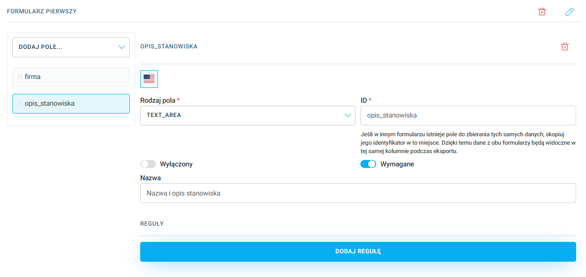
Another field is TEXT-AREA, which is used to collect longer text information, like for example a job description, a contest question answer or a participant's bio:
The PHONE_NUMBER field lets you collect the user's contact number, so organizers and participants can stay in touch, plus it helps notify about any unexpected changes during the event. While buying a ticket, the customer enters their phone number with a prefix, which you can choose from a list:
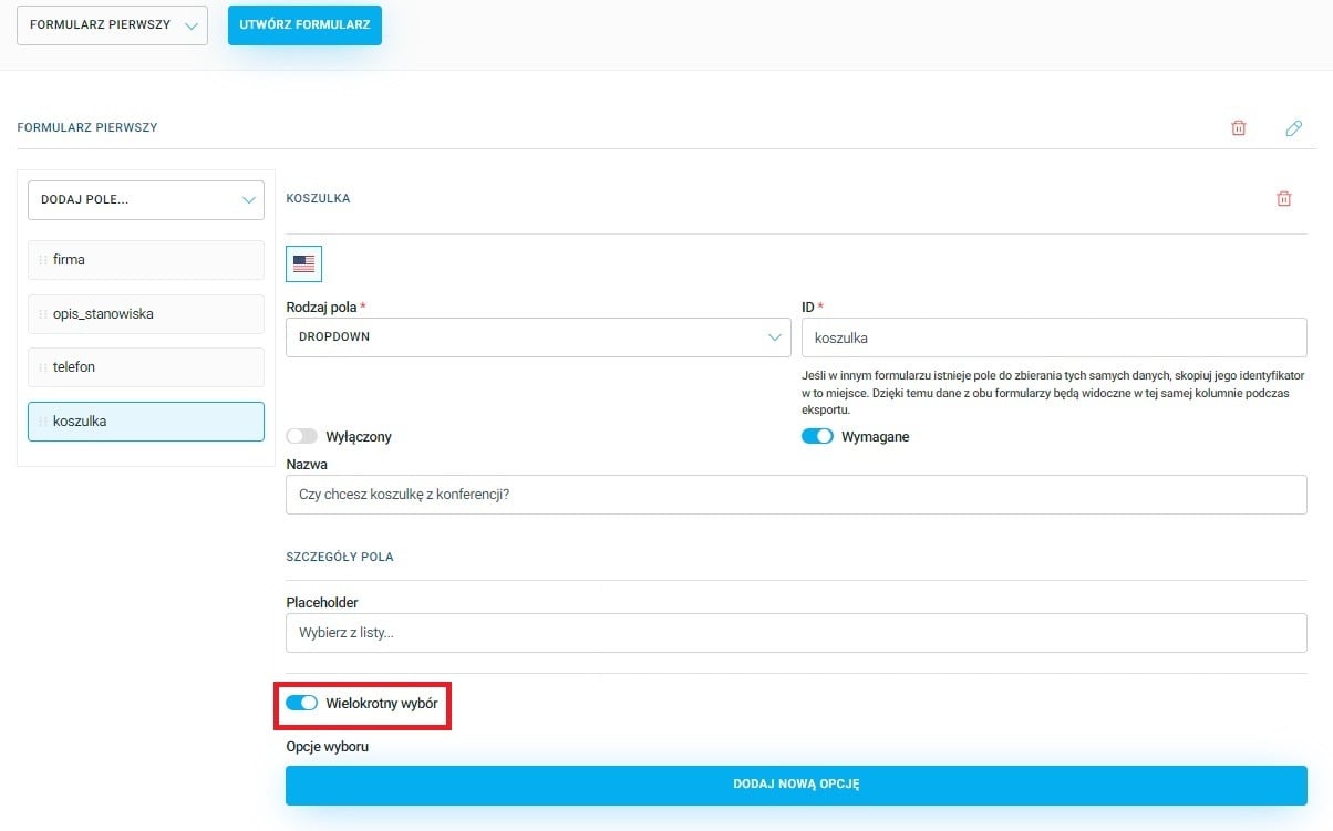
In the DROPDOWN field you can add several options for the participant to choose from, like t-shirt size, food preferences or demographic data. Click Add New Option and add a closed list of choices:
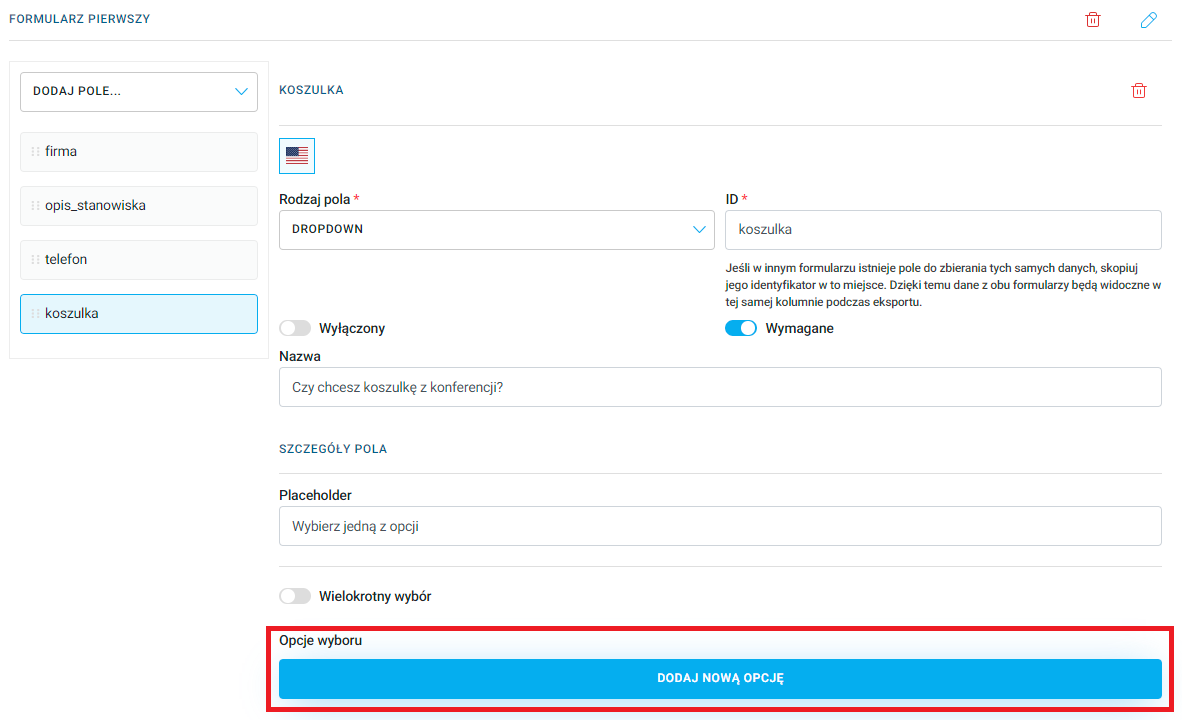
There's also an option to allow multiple selections, so an event participant can pick more than one variant. If you want to add this option - slide the Multiple choice toggle to the right:
NOTE!
Placeholder is a field that sets the text visible before the user makes a selection. Add your text here, for example: Choose from the list..., which will be shown before the person buying the ticket opens the available list:
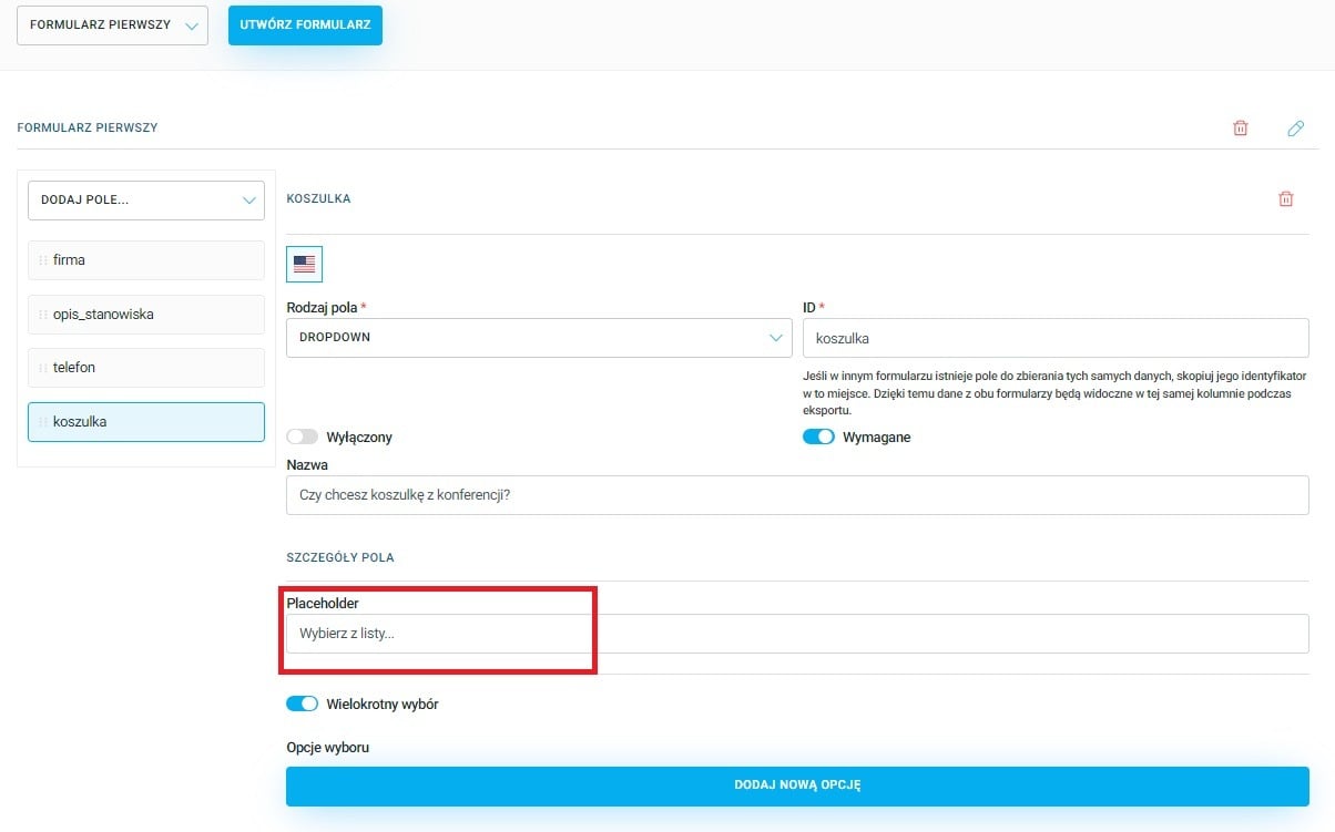

In the Default option index field you can pick an option that will be automatically selected when the form opens. Manually enter or set with the arrows on the right side of the field which option will be selected. This function lets you suggest or set the most commonly chosen option for the user to make filling out the form easier. In most cases, you should leave this field empty to give the participant complete freedom of choice:
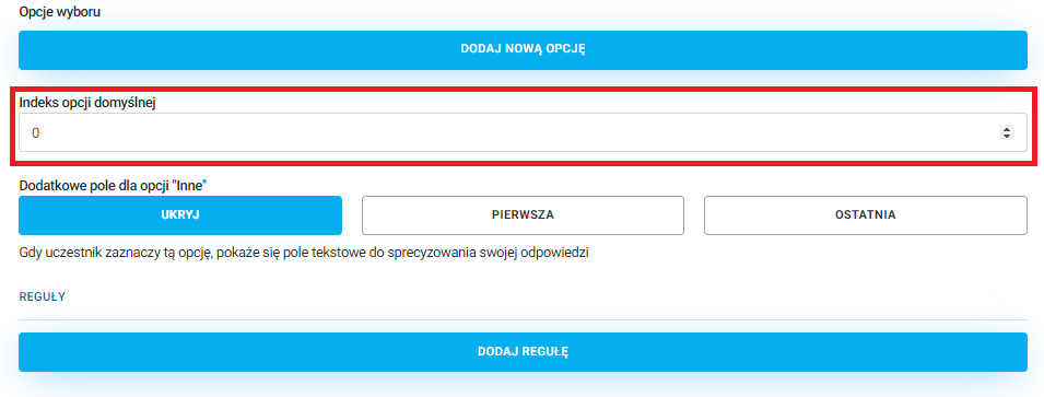
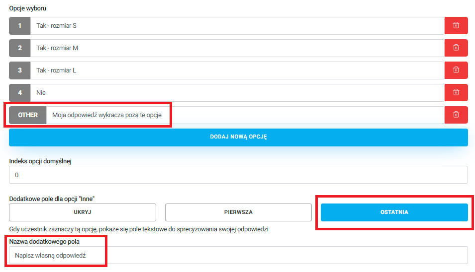
Another option is letting the user enter their own answer if none of the predefined values suits them. The dropdown can show an other option, which will display an extra text field to specify the answer when selected:
The CHECKBOX field lets the user check or uncheck an option. This field is most often used to express consent, like event terms and conditions, or agreements for marketing actions.
NOTE!
With this type of field, you can add only one option to check. If you want to have more than one checkbox in your form, you need to add more fields of the same type from the dropdown list Add field in the Ticket forms module.
In the Checkbox text field enter the text that will be displayed next to the checkbox. Here you can add interactive text, so when clicked, it will redirect the user to a given address, for example a PDF with terms and conditions. Where you want to add a link, add {} by entering inside the braces a number starting from 0. Then, click the Add new interactive text:
There are two fields:
Interactive Text: type what should show up in place of the curly bracket from the Choice Field Text field.
Link: put the link here, where the user will be redirected after clicking the highlighted text.
ATTENTION!
The number in the first added bracket must be 0. If you want to add more clickable texts, put the numbers in the brackets one after another 1, 2, 3,...:
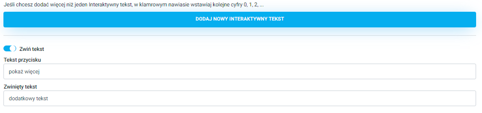
If the text you've added is too long, you can use the text collapsing feature. To do this, slide the Collapse text toggle to the right. In the Button text field, enter for example "Read more", and in the Collapsed text field, this is what will show up after expanding the text. In the collapsed text you can also put interactive text, with a link to an external page, by using curly brackets that were described above in the Interactive text section:
The COUNTRY field lets you pick a country from a dropdown list. You can use it to choose the participant’s country of residence:
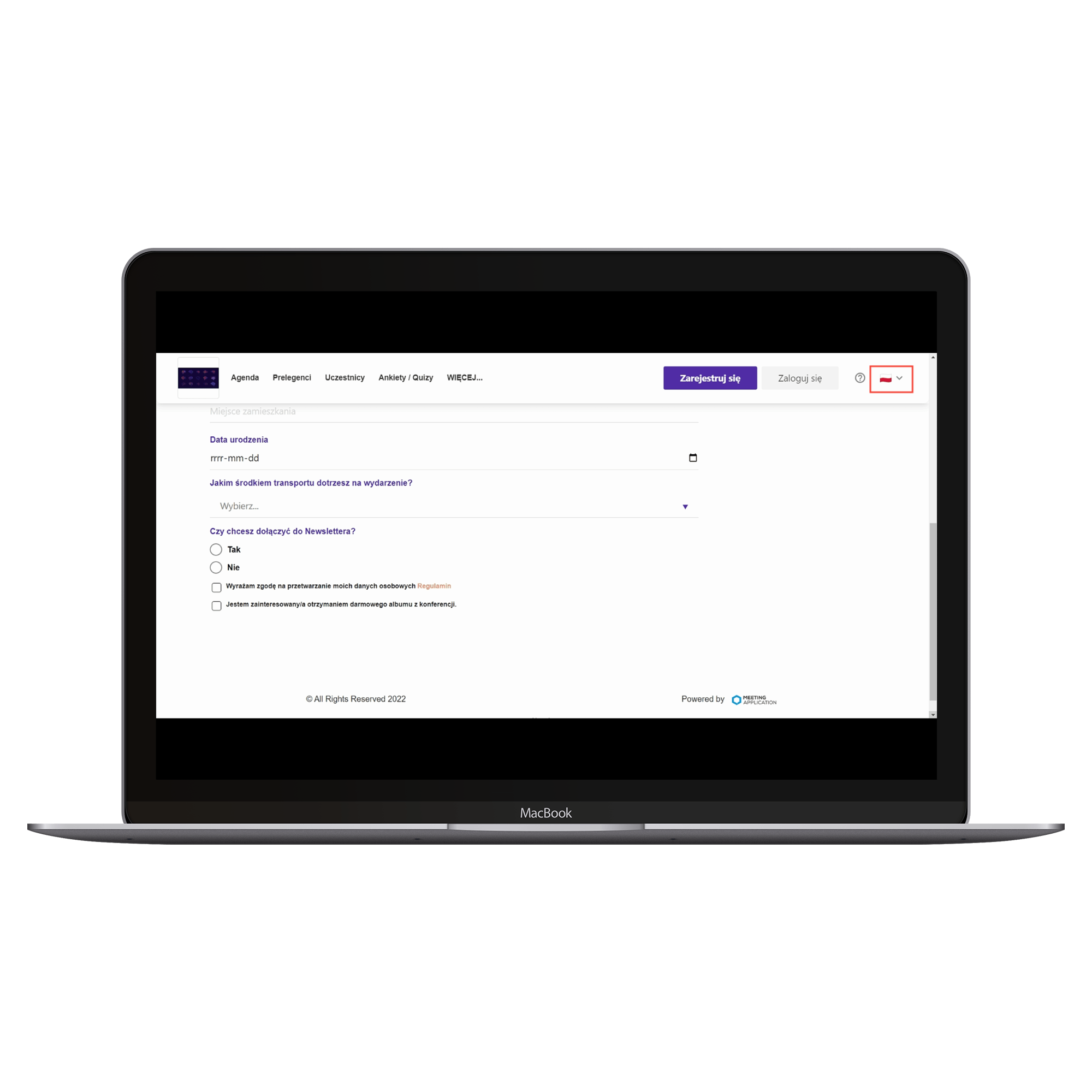
In the DATE field, the event participant can select a date from a calendar. For example, it can be their date of birth for adult-only events or when the participant plans to arrive at a multi-day conference:
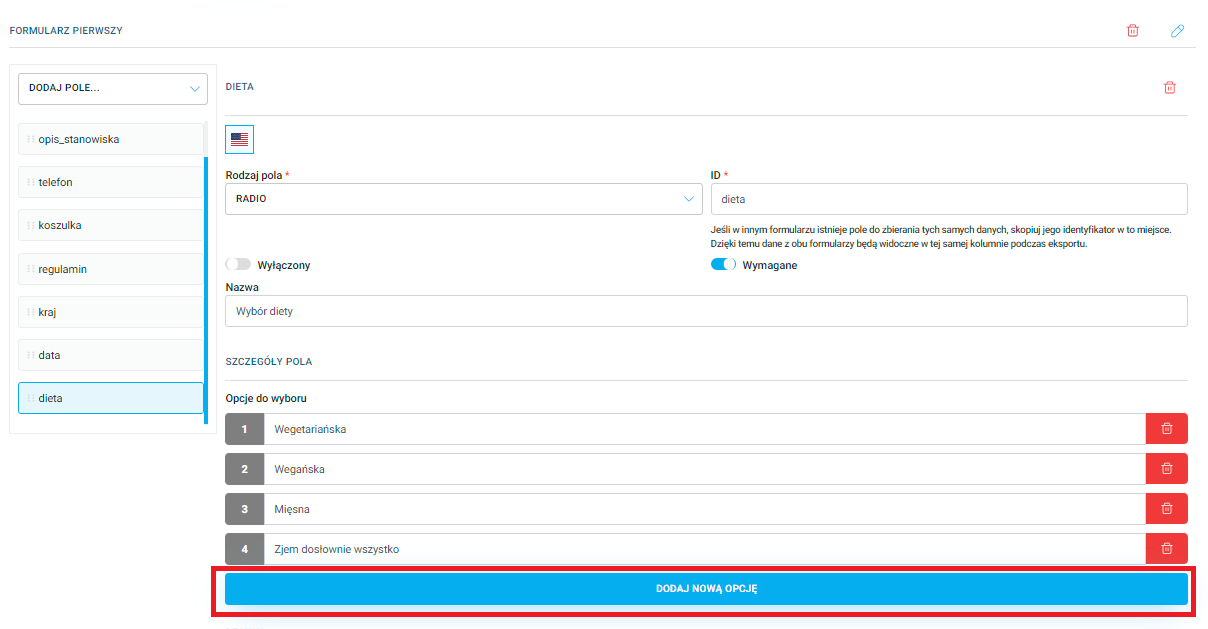
The RADIO field lets users pick just one option from the prepared choices. If you select one of the values, all the other ones will be unchecked automatically.
Add as many items as you like using the Add New Option button and give them names:
PRO TIP
You can use this field in the form, for example, when choosing a diet. If your event includes catering for participants, when filling out the form, the user can only select one type of diet from the available options - if a participant selects the vegan diet, at the same time the meat diet will be deselected, and vice versa.
The INFORMATION field is for adding extra details for participants, for example location details like driving directions or info about available parking, as well as contact info for participants who want to get in touch with the organizer if they have questions or concerns. You can put in a phone number or email address.
In the Name field, enter the appropriate text. You can also create interactive text here that leads to the specified link. To do this, in the Name field, insert a curly bracket with the appropriate number, starting from {0}. Then click the Add new interactive text bar and fill in the available fields the same way as for a CHECKBOX field:
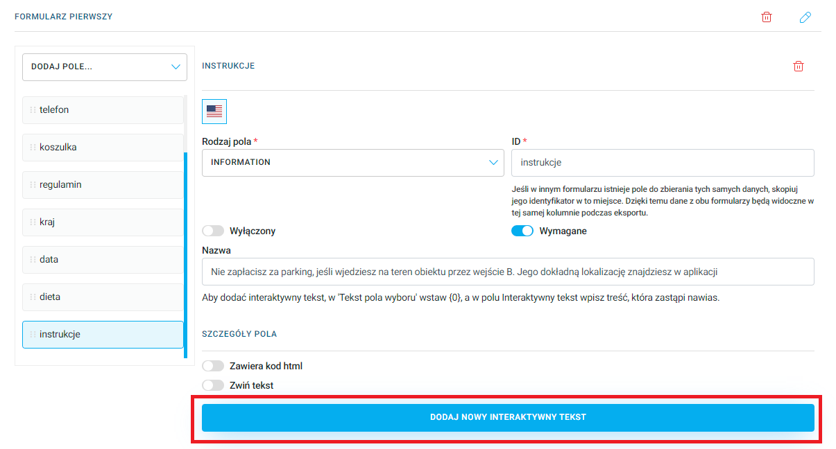
If the content of the field is too long, you can use the text folding function by moving the Collapse text slider to the right.
This field also allows you to add content formatted with HTML code. To do this, move the Contains HTML code slider to the right, then enter the previously prepared code into the HTML information field.
Every type of field in Tickets forms has an option to add rules that control the visibility of a specific field. This feature lets you decide if that field gets shown to the participant when a certain option or info is selected/entered in another Tickets forms field.
To add a rule, click the Add rule:
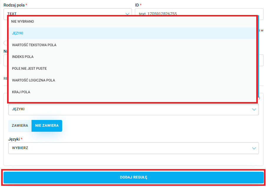
The Contains / Does not contain button controls how the rules work and what fields are visible. If you select Contains, the rule will apply to all fields that have a set text value or information. The Does not contain button, on the other hand, works for all fields without a set value.
NOTE!
The ability to add rules depends on the types of fields previously added. For example, if the COUNTRY field was NOT added to the form, you won't be able to set a Country field rule that determines the visibility of a dependent field, which is the COUNTRY field. We recommend adding all the fields in the form first, and as the last step, setting up the visibility rules.
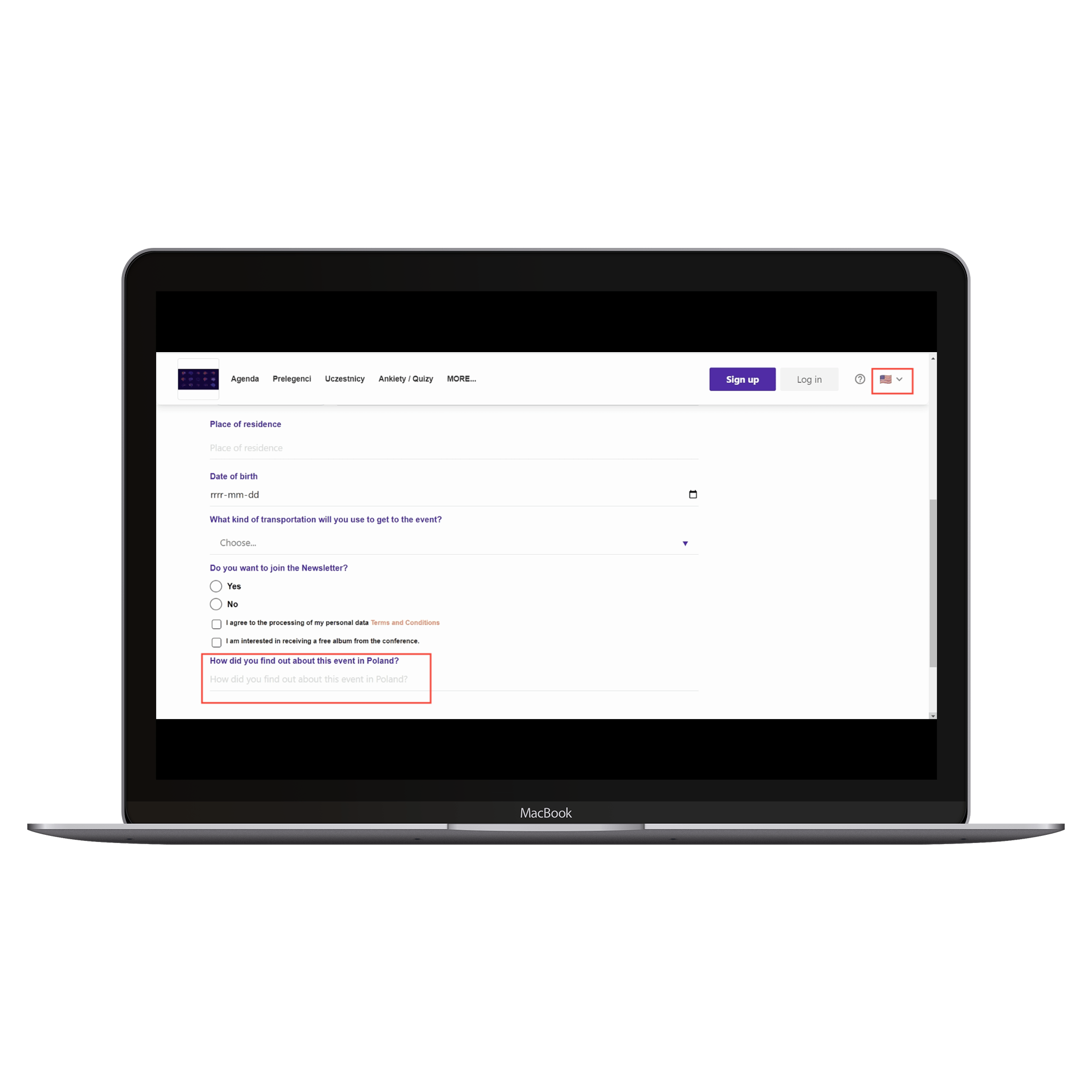
The first type of rule is Languages. On the event Landing Page, in the top right corner you can pick the site's language from the dropdown. The number of languages available depends on the number of language layers added in the admin panel. When you select Contains and choose English, this field will only be visible to users who picked the English version of the Landing Page:
EXAMPLE:
Add a field of type TEXT, in the Name field type "How did you find out about this event in Poland?". Next, add a rule of type Languages, check the Contains button and choose English. If a participant has the English version of the Landing Page set, this question will be displayed:
For the Polish version of the event Landing Page, this field is not visible:
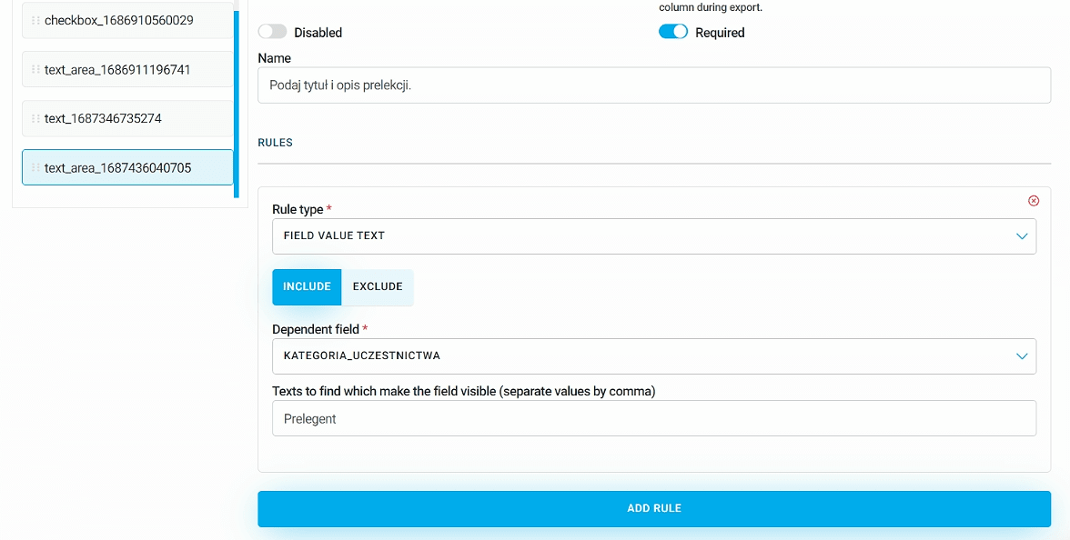
Another rule is Text value of the field. In the field Texts to find that make the field visible (separate values with commas) enter the set text value that will determine when the rule works. The dependent field for this rule is TEXT or TEXT_AREA. Pick one of those two options from the list, then in the next field type the text that will make the target field show:
EXAMPLE:
Add a field of type TEXT and in the Name field enter "Enter your category of participation in the event (Participant/Speaker/Moderator)":
Next, add the TEXT_AREA field with the name "Enter the title and description of the presentation". Click Add rule. Choose a rule of type Field text value and hit Contains. In Dependent field pick the TEXT field you just added, and in the next field, type "Speaker" and save the changes:
If, while filling out the form, the participant enters "Speaker" as the category, a field will pop up where they can provide info about the presentation topic:
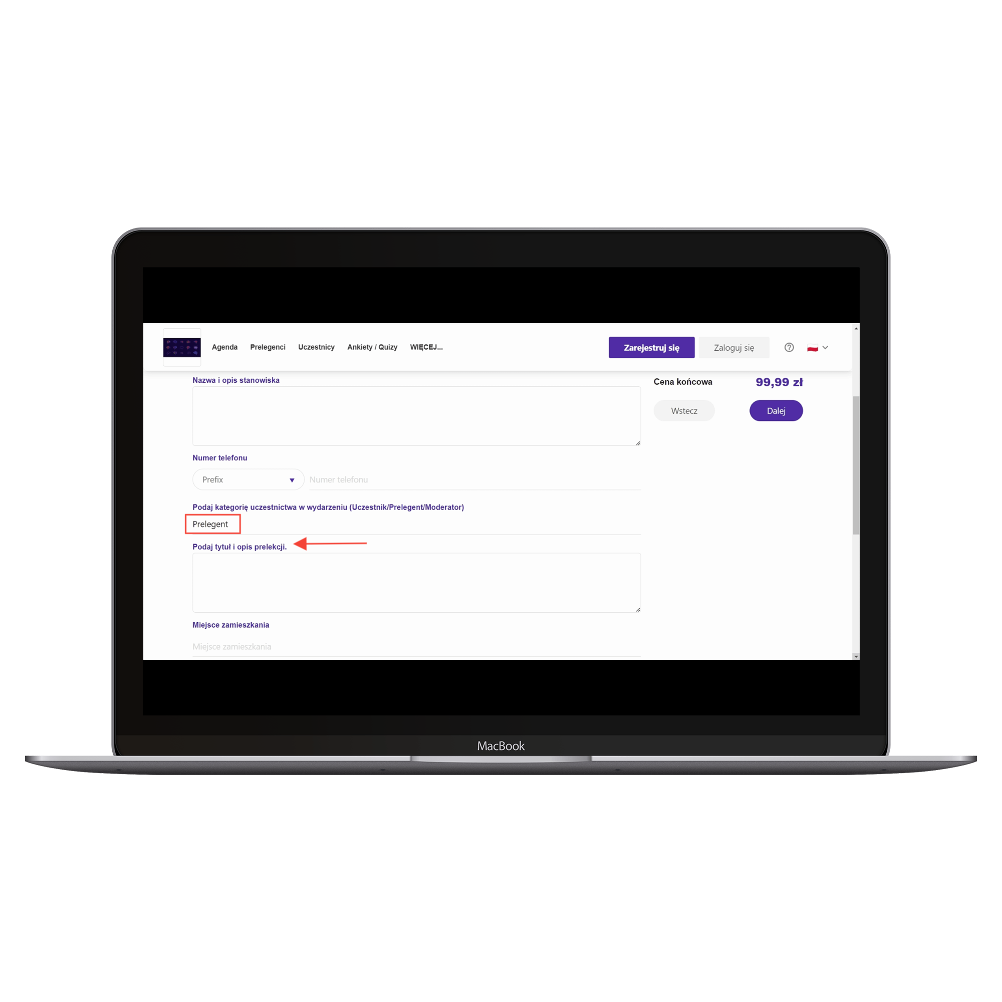
If someone enters Participant or Moderator, this field will not be displayed.
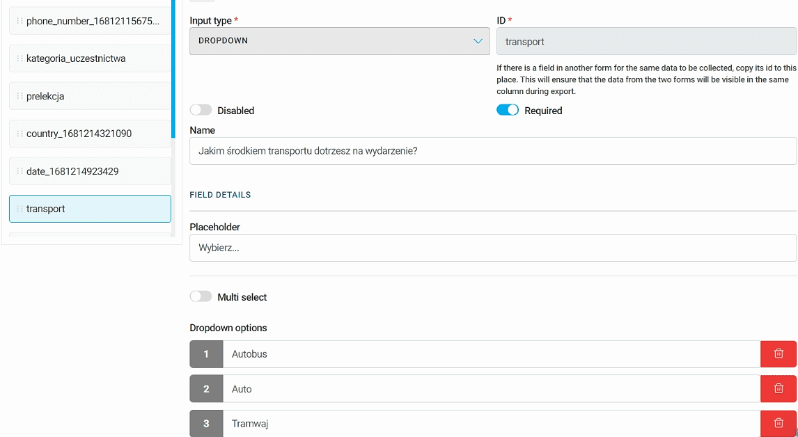
Another rule is Field index. The dependent dropdown field here is the DROPDOWN field. Depending on what options were added in the DROPDOWN field, the same values will show up in the dropdown list. The option you pick in the dropdown decides whether the field where this rule was added is visible:
EXAMPLE:
Add a DROPDOWN field. In the Name enter "What kind of transportation will you use to get to the event?". Then fill in the Placeholder and add Options:
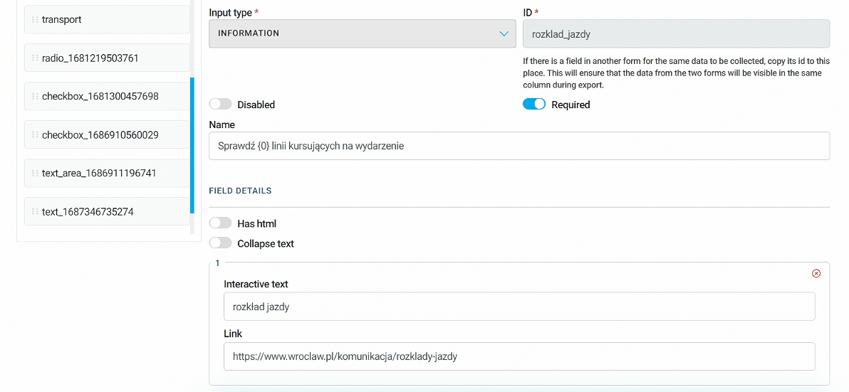
In the next step, add an INFORMATION field. In Name enter "Check the schedule for lines going to the event" and add Interactive text:
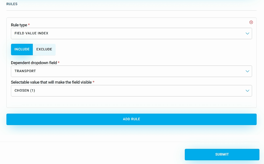
Add a rule and choose the rule type Field index. Click Contains and from the dropdown list of dependent fields, select the previously added dropdown and the specific option. In this case, it'll be the Bus option:
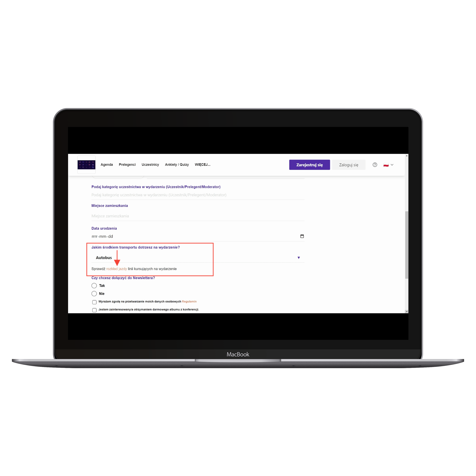
RESULT: If a participant filling out the registration form chooses bus as their means of transportation, a message will show up with a redirect to an external site with the schedules of specific bus lines:
The Field is not empty rule applies to every type of field except for the INFORMATION field. This rule works when one of the selected fields is optional. If the user fills it in, another field will show up according to the set rule. To do this, choose from the dropdown list which field should control the visibility:
EXAMPLE:
Add a TEXT field, enter Name as "Enter your preferred meal type: ". Mark this field as optional by moving the Required toggle to the left:
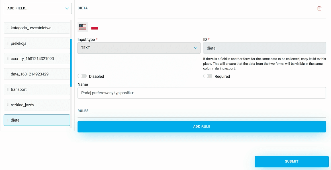
Next, add a new text field and set it as not required. In the Name field, enter "List any possible food allergies". Click Add rule and pick the rule type Field is not empty from the dropdown list. For the dependent field, select the text field you previously added with preferred meal type, and save your changes:
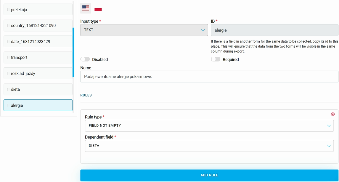
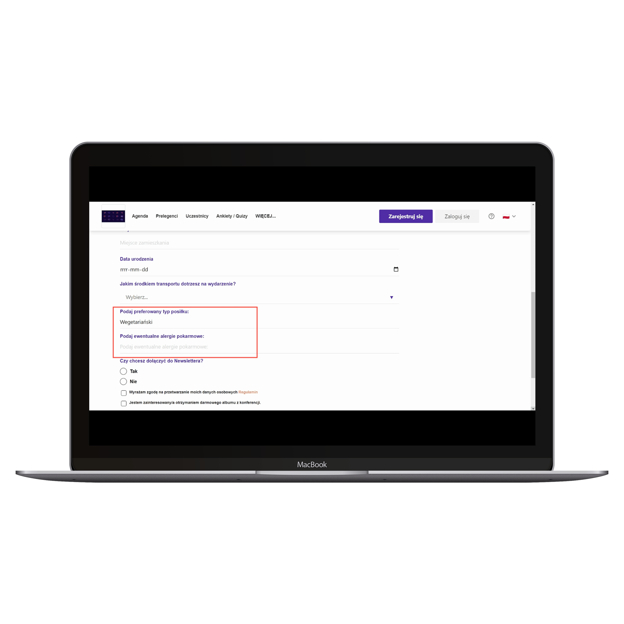
EFFECT: This way, when someone signs up for the event and enters their preferred meal type, a new optional field for any possible food allergies will show up:
Field logical value is a rule where the dependent field is a CHECKBOX. This field’s visibility depends on whether the checkbox is marked True or False:
For example, add a CHECKBOX field with the text: I’m interested in receiving a free conference album:
Next, add the TEXT_AREA field and in the name enter Enter delivery address:. Add a rule of type Field logical value, Visible for True and the dependent field of the previously added checkbox:
This way, on the Landing Page of the event, in ticket forms, when a user checks the box to get a free conference album, a text field will show up to enter the shipping address:
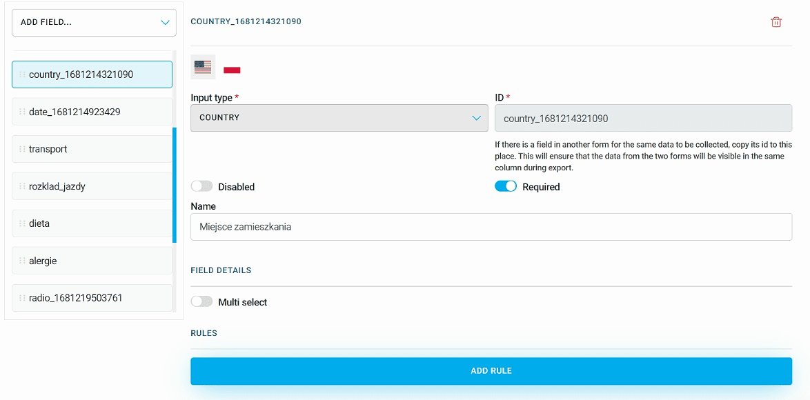
The next rule is Field country. Its dependent field is the COUNTRY. Pick from the dropdown list of available countries for which this field should be visible or hidden. This field will only show up for participants who select the specified country in the COUNTRY field:
EXAMPLE:
Add a field of type COUNTRY, and for the Name enter "Place of residence":
Next, add the TEXT field, and in the Name enter "Enter State". Click Add rule and select the Field country rule. As Dependent field select the previously added field with the place of residence. In the Countries where the field will be visible field, use the dropdown of countries to select United States:
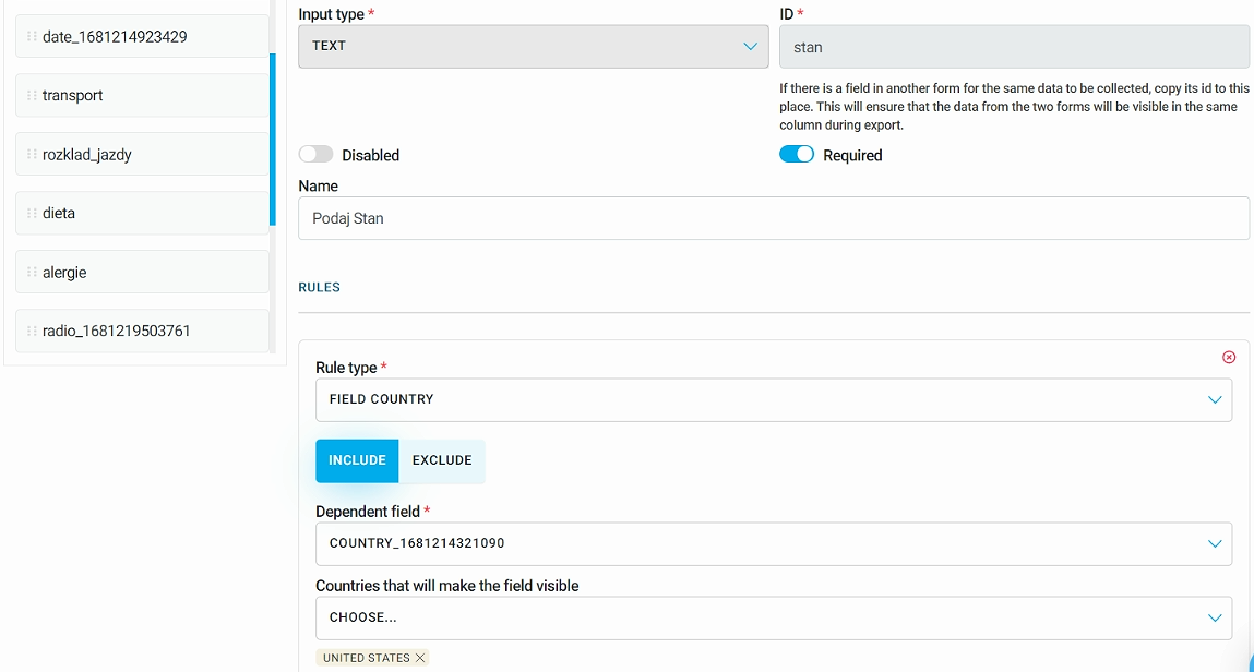
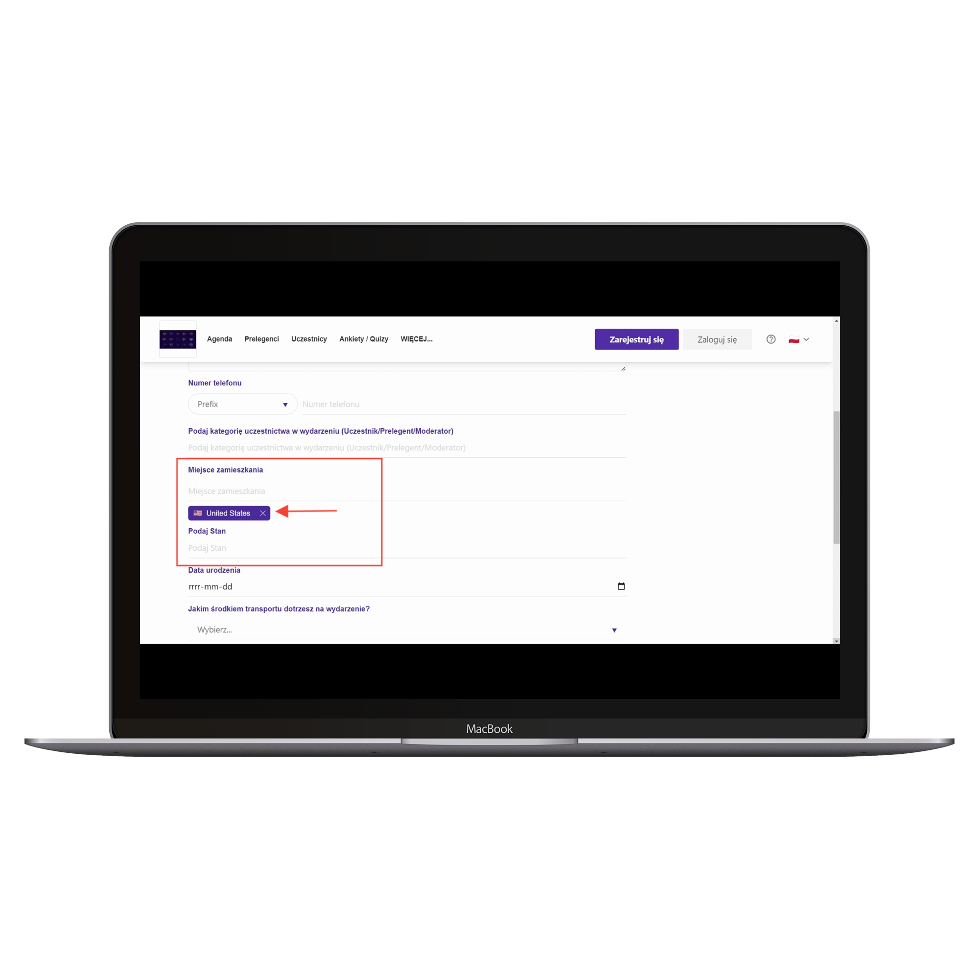
Thanks to this, if a participant selects United States as their place of residence, they will be asked to fill out another field, which is specifying a particular State:
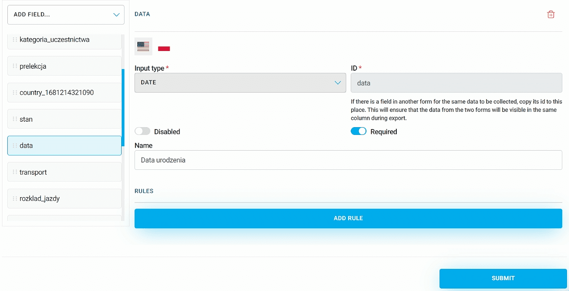
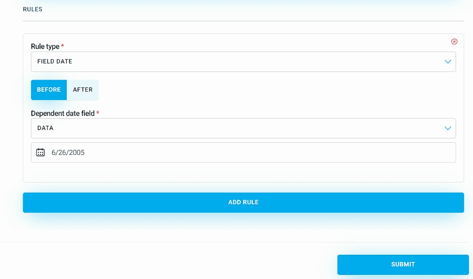
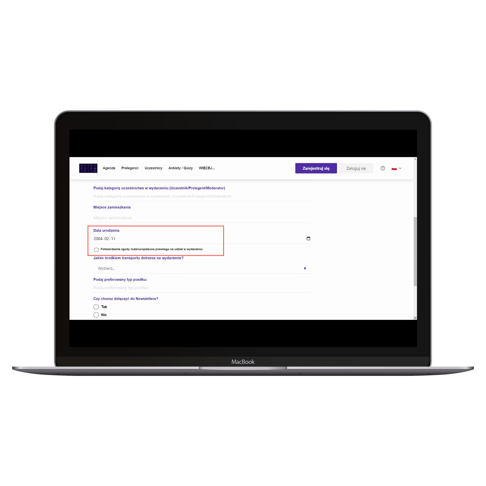
The last rule is Field date, and its dependent field is DATE. Pick a specific date, and then set the field's visibility for all dates that fall before or after the one you picked. If the question is only for adults, set the field to be visible for everyone whose date of birth is before the threshold date you set. This way, the field won't show up for minors:
EXAMPLE:
Add a field of type DATE, and in the Name enter "Date of birth":
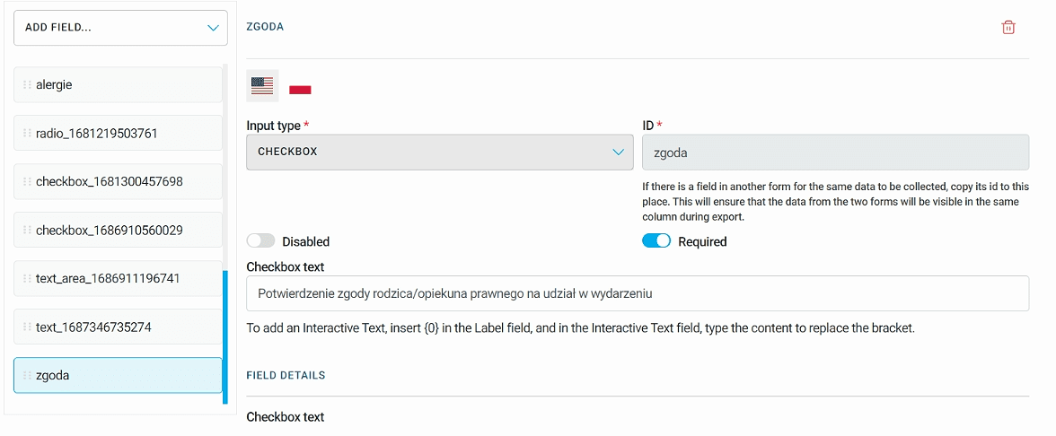
Next, add a field of type CHECKBOX, and in the Checkbox text enter "Parent/legal guardian consent to participate in the event":
Click Add rule and choose Field date. Click the Before button, set the event date and save changes:
Thanks to this, a minor filling out the registration form for the event will have to tick the required box confirming the consent of a parent or legal guardian for their participation in the event:
Have a great event with Meeting Application!