You've organized an event, got a mobile app, a website… but you want everything to work together and make sure your participants have access to all the key info in one place? That's where iframes come in – small bits of code you can paste onto your site to display things like extra announcements, your own photo gallery, a button to your newsletter – really, the possibilities are endless.
In Meeting Application, we’ve put together ready-to-go iframes for the most commonly used components – just copy, paste, and you’re set. In this article, we’ll show you a few sample configurations you can set up in 5 minutes, and your attendees will love it. 🚀

!important declaration:color: #ffffff !important; 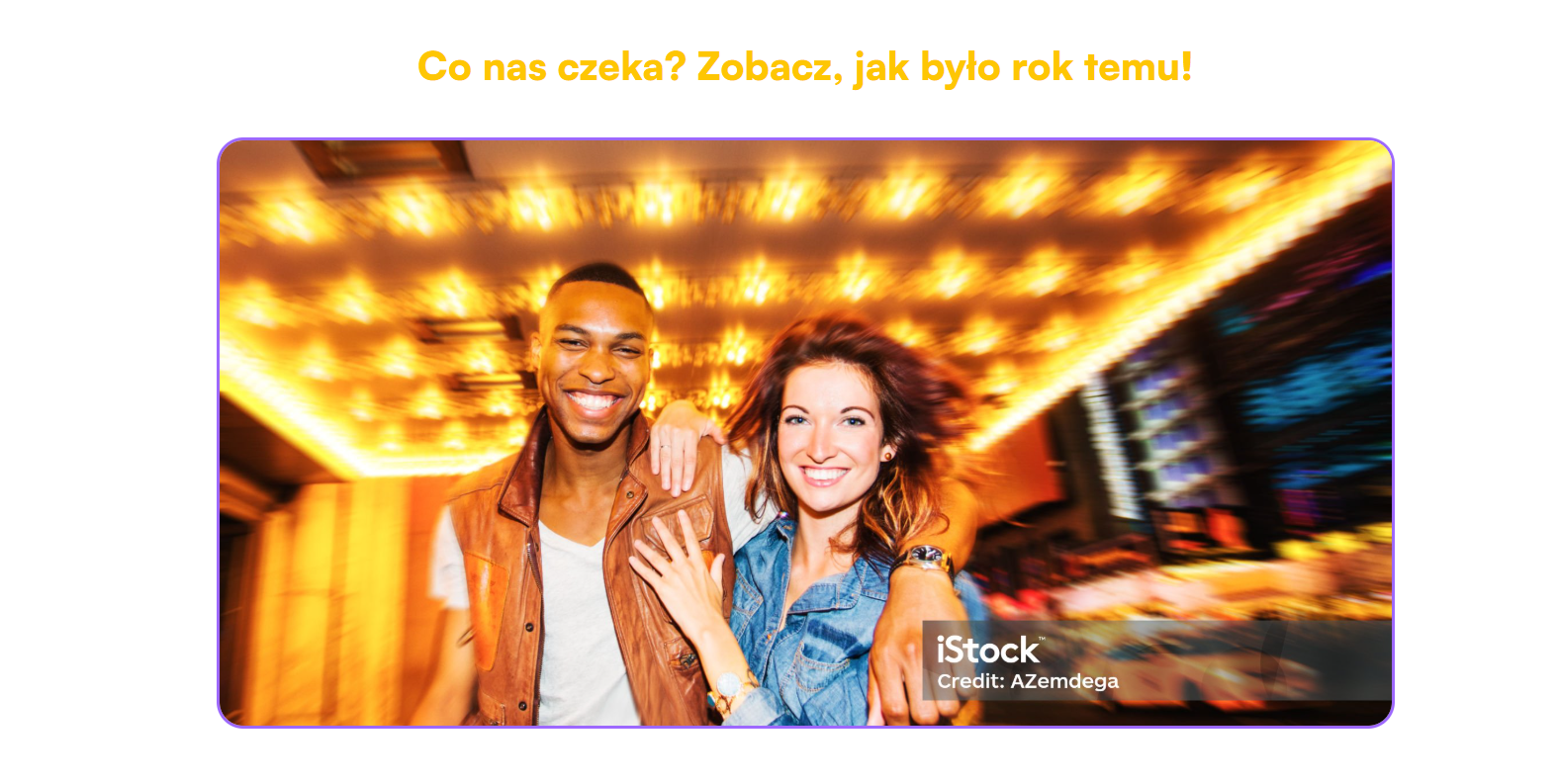
1. Changing the photo and its description
In the HTML code find the <img> element, e.g.:
html

<imgsrc="https://media.istockphoto.com/id/482132777/pl/zdj%C4%99cie/para-w-nowym-jorku.jpg?s=2048x2048&w=is&k=20&c=..."alt="Zdjęcie Pary w Nowym Jorku"
/>
To replace the photo:
Change the src value to the full image URL found on the internet (like on your own server or a photo site).

To change the description:
The alt value should be short and tell what’s on the image (e.g. "Outdoor concert").
2. Changing the frame color
In the <style> section, find the .frame class and the line:
css

border: 0.25rem solid rgba(91, 3, 254, 0.6);
Change the color (so the rgba(...) value) to any other you like, e.g. #ff6600, rgba(200, 50, 50, 0.8) or black.
3. Changing the frame corners
In that same .frame class you’ll find:
css

border-radius: 1.875rem;
You can change the value of border-radius to make it smaller (less rounded corners) or bigger (more rounded). For perfectly straight corners, set it to 0.
HTML code to copy:
<!DOCTYPE html>
<html lang="pl">
  <head>
    <meta charset="UTF-8" />
    <meta name="viewport" content="width=device-width, initial-scale=1.0" />
    <title>Obraz Festiwalowy</title>
    <style>
      * {
        margin: 0;
        padding: 0;
        box-sizing: border-box;
      }

      body,
      html {
        width: 100%;
        font-family: Arial, sans-serif;
        display: flex;
        align-items: center;
        justify-content: center;
      }

      .frame {
        max-width: 100%;
        max-height: 100%;
        border: 0.25rem solid rgba(91, 3, 254, 0.6);
        border-radius: 1.875rem;;
        overflow: hidden;
        transition: transform 0.4s ease;
        display: inline-block;
        margin: 1.5rem;
      }

      .frame:hover {
        transform: scale(1.02);
      }

      .frame img {
        display: block;
        width: 100%;
        height: auto;
        object-fit: cover;
      }

      @media (max-width: 768px) {
        .frame {
          border-radius: 0.9375rem;
          border-width: 0.125rem;
        }
      }

      @media (max-width: 480px) {
        .frame {
          border-radius: 0.9375rem;
          border-width: 0.125rem;
        }
      }
    </style>
  </head>
  <body>
    <div class="frame">
      <img
        src="https://media.istockphoto.com/id/482132777/pl/zdj%C4%99cie/para-w-nowym-jorku.jpg?s=2048x2048&w=is&k=20&c=ehVX4hPfEBhhfIzy6RZvOLgAcSYt-QLhGqJB6UzaZuE="
        alt="Zdjęcie Pary w Nowym Jorku"
      />
    </div>
  </body>
</html>
1. Changing the photo and its description
In the HTML code, find the <img> elements, for example:
<imgsrc="https://media.istockphoto.com/id/1509148271/pl/zdj%C4%99cie/..."alt="Festiwal – serce w dłoniach"
/>
To swap the photo:
Swap the src address for a new link to a photo hosted online – for example, on your own server or from another platform (istockphoto, unsplash, etc.).
To change the description:
Enter new content in alt, e.g. "Concert at night" – it should describe what's in the picture.
2. Adding a new photo
To add a new photo in the right column (at the bottom):
Copy the whole block with the class .small-frame, for example:
<div class="small-frame">
  <imgsrc="URL"alt="Opis zdjęcia"
/>
</div>
Paste it below the last .small-frame, before the end of </div> closing .right-column.
3. Changing the border color
In <style> find the classes .left-column and .small-frame and the line:
border: 0.25rem solid rgba(91, 3, 254, 0.6);
You can change the rgba(...) color to something else – e.g. #ff6600, rgba(200, 0, 0, 0.8) or black.
4. Changing the corner radius
These same classes also have:
border-radius: 1.875rem;
You can increase the value (more rounded corners) or decrease it (sharper corners). For rectangles – set 0.
HTML code to copy:
<!DOCTYPE html>
<html lang="pl">
  <head>
    <meta charset="UTF-8" />
    <meta name="viewport" content="width=device-width, initial-scale=1.0" />
    <title>Festival Collage</title>
    <style>
      * {
        margin: 0;
        padding: 0;
        box-sizing: border-box;
      }

      body,
      html {
        width: 100%;
        font-family: Arial, sans-serif;
        display: flex;
        align-items: center;
        justify-content: center;
      }

      .collage-container {
        display: flex;
        gap: 1.5rem;
        max-width: 100%;
        max-height: 100%;
        padding: 1.5rem;
      }

      .left-column {
        flex: 1;
        border: 0.25rem solid rgba(91, 3, 254, 0.6);
        border-radius: 1.875rem;
        overflow: hidden;
        transition: transform 0.4s ease;
      }

      .right-column {
        flex: 1;
        display: flex;
        flex-direction: column;
        gap: 1.5rem;
      }

      .small-frame {
        flex: 1;
        border: 0.25rem solid rgba(91, 3, 254, 0.6);
        border-radius: 1.875rem;
        overflow: hidden;
        transition: transform 0.4s ease;
      }

      .left-column:hover,
      .small-frame:hover {
        transform: scale(1.03);
      }

      img {
        width: 100%;
        height: 100%;
        object-fit: cover;
        display: block;
      }

      @media (max-width: 768px) {
        body {
          padding: 0.75rem;
          align-items: flex-start;
        }

        .collage-container {
          flex-direction: column;
          gap: 1rem;
          max-width: 100%;
        }

        .left-column,
        .right-column {
          flex: none;
          min-width: 0;
          width: 100%;
        }

        .right-column {
          gap: 1rem;
        }

        .left-column,
        .small-frame {
          border-radius: 1.25rem;
          border-width: 0.1875rem;
        }
      }

      @media (max-width: 480px) {
        .left-column,
        .small-frame {
          border-radius: 0.9375rem;
          border-width: 0.125rem;
        }
      }
    </style>
  </head>
  <body>
    <div class="collage-container">
      <div class="left-column">
        <img
          src="https://media.istockphoto.com/id/1509148271/pl/zdj%C4%99cie/m%C5%82oda-kobieta-patrzy-w-kamer%C4%99-na-tle-%C5%9Bwiate%C5%82-diabelskiego-m%C5%82yna-para-w-nocy-podczas.jpg?s=2048x2048&w=is&k=20&c=PO1NAtBK2vJgZQ0yD1G8F3ByteaOd8ms1K0cm0ODwpg="
          alt="Festival – heart in hands"
        />
      </div>
      <div class="right-column">
        <div class="small-frame">
          <img
            src="https://media.istockphoto.com/id/2037883326/pl/zdj%C4%99cie/do%C5%82%C4%85cz-do-nas-na-festiwalu-muzycznym-tego-lata.jpg?s=2048x2048&w=is&k=20&c=280cJFT98RjKPO_73UGlRqiGlPAcoVWSWfXv6rPDKQU="
            alt="Couple in New York"
          />
        </div>
        <div class="small-frame">
          <img
            src="https://media.istockphoto.com/id/1557905719/pl/zdj%C4%99cie/m%C5%82odzi-szcz%C4%99%C5%9Bliwi-przyjaciele-korzystaj%C4%85cy-z-telefonu-kom%C3%B3rkowego-podczas-wyst%C4%99pu-na-%C5%BCywo.jpg?s=2048x2048&w=is&k=20&c=IScF_-Y3zUG5boC0kUjQyvLyracysl8dryaj9_fRrg4="
            alt="Crowd at concert"
          />
        </div>
      </div>
    </div>
  </body>
</html>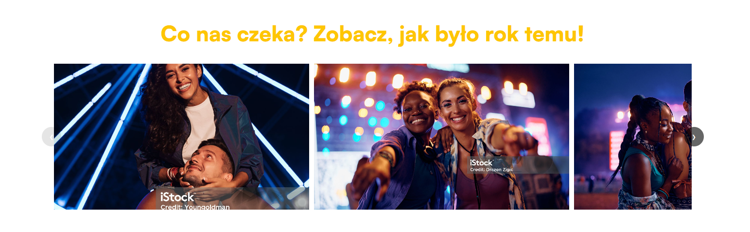
In your HTML code, find the <img> elements, for example:
<imgsrc="https://media.istockphoto.com/id/1509148271/pl/zdj%C4%99cie/..."alt="Festiwal – serce w dłoniach"
/>
To swap out the photo:
Replace the src with a new link to a photo that's available online – for example, on your own server or from an external platform (istockphoto, unsplash, etc.).
To change the description:
Enter new text in alt, e.g. "Concert at night" – it should describe what's in the photo.
Look in the HTML code for the section with <div class="carousel-track">. Inside it are photos added as <img> tags:
<div class="carousel-track">
  <imgsrc="LINK_DO_ZDJĘCIA"alt="OPIS_ZDJĘCIA"
  />
  <!-- kolejne zdjęcia... --></div>
Each photo in the carousel is one <img> tag. To add your own photo:
Copy the existing tag <img>,
Paste it below (inside .carousel-track),
Change the value in src to a link to your photo on the Internet,
Change alt to a short description of what's in the photo (important for accessibility and SEO).
HTML code to copy:
<!DOCTYPE html>
<html lang="pl">
  <head>
    <meta charset="UTF-8" />
    <meta name="viewport" content="width=device-width, initial-scale=1.0" />
    <title>Photo Carousel</title>
    <style>
      .carousel-container {
        position: relative;
        width: 100%;
      }

      .carousel-wrapper {
        overflow: hidden;
        margin: 0 2.5rem;
        position: relative;
      }

      .carousel-track {
        display: flex;
        transition: transform 0.4s ease-in-out;
      }

      .carousel-track img {
        flex-shrink: 0;
        flex-basis: 40%;
        height: 18.75rem;
        margin-right: 0.625rem;
        object-fit: cover;
        max-width: 40%;
        box-sizing: border-box;
      }

      .carousel-button {
        position: absolute;
        top: 50%;
        transform: translateY(-50%);
        background-color: rgba(0, 0, 0, 0.6);
        color: white;
        border: none;
        width: 2.5rem;
        height: 2.5rem;
        padding: 0;
        border-radius: 50%;
        font-size: 1.5rem;
        cursor: pointer;
        z-index: 10;
        transition: background-color 0.2s ease, transform 0.1s ease;
        display: flex;
        align-items: center;
        justify-content: center;
      }

      .carousel-button:hover {
        background-color: rgba(0, 0, 0, 0.8);
      }

      .carousel-button:active {
        transform: translateY(-50%) scale(0.95);
      }

      .carousel-button:disabled {
        background-color: rgba(0, 0, 0, 0.2);
        cursor: not-allowed;
        opacity: 0.5;
        transform: translateY(-50%);
      }

      .carousel-button.prev {
        left: 0.9375rem;
      }

      .carousel-button.next {
        right: 0.9375rem;
      }

      @media (max-width: 768px) {
        .carousel-track img {
          flex-basis: 100%;
          max-width: 100%;
          margin-right: 0.3125rem;
        }

        .carousel-wrapper {
          margin: 0;
        }

        .carousel-button {
          width: 2.1875rem;
          height: 2.1875rem;
          font-size: 1.3rem;
        }

        .carousel-button.prev {
          left: 0.3125rem;
        }
        .carousel-button.next {
          right: 0.3125rem;
        }
      }

      @media (max-width: 480px) {
        .carousel-track img {
          margin-right: 0.1875rem;
        }
        .carousel-button {
          width: 1.875rem;
          height: 1.875rem;
          font-size: 1.1rem;
        }
        .carousel-button.prev {
          left: 0.125rem;
        }
        .carousel-button.next {
          right: 0.125rem;
        }
      }
    </style>
  </head>
  <body>
    <div class="carousel-container">
      <button class="carousel-button prev" aria-label="Previous slide">
        ‹
      </button>
      <div class="carousel-wrapper">
        <div class="carousel-track">
          <img
            src="https://media.istockphoto.com/id/1509148271/pl/zdj%C4%99cie/m%C5%82oda-kobieta-patrzy-w-kamer%C4%99-na-tle-%C5%9Bwiate%C5%82-diabelskiego-m%C5%82yna-para-w-nocy-podczas.jpg?s=2048x2048&w=is&k=20&c=PO1NAtBK2vJgZQ0yD1G8F3ByteaOd8ms1K0cm0ODwpg="
            alt="Photo 1"
          />
          <img
            src="https://media.istockphoto.com/id/2037883326/pl/zdj%C4%99cie/do%C5%82%C4%85cz-do-nas-na-festiwalu-muzycznym-tego-lata.jpg?s=2048x2048&w=is&k=20&c=280cJFT98RjKPO_73UGlRqiGlPAcoVWSWfXv6rPDKQU="
            alt="Photo 2"
          />
          <img
            src="https://media.istockphoto.com/id/1557905719/pl/zdj%C4%99cie/m%C5%82odzi-szcz%C4%99%C5%9Bliwi-przyjaciele-korzystaj%C4%85cy-z-telefonu-kom%C3%B3rkowego-podczas-wyst%C4%99pu-na-%C5%BCywo.jpg?s=2048x2048&w=is&k=20&c=IScF_-Y3zUG5boC0kUjQyvLyracysl8dryaj9_fRrg4="
            alt="Photo 3"
          />
          <img
            src="https://media.istockphoto.com/id/1557905719/pl/zdj%C4%99cie/m%C5%82odzi-szcz%C4%99%C5%9Bliwi-przyjaciele-korzystaj%C4%85cy-z-telefonu-kom%C3%B3rkowego-podczas-wyst%C4%99pu-na-%C5%BCywo.jpg?s=2048x2048&w=is&k=20&c=IScF_-Y3zUG5boC0kUjQyvLyracysl8dryaj9_fRrg4="
            alt="Photo 4"
          />
        </div>
      </div>
      <button class="carousel-button next" aria-label="Next slide">›</button>
    </div>

    <script>
      document.addEventListener("DOMContentLoaded", function () {
        const wrapper = document.querySelector(".carousel-wrapper");
        const track = document.querySelector(".carousel-track");
        const prevButton = document.querySelector(".carousel-button.prev");
        const nextButton = document.querySelector(".carousel-button.next");
        const images = Array.from(track.children);

        if (
          !wrapper ||
          !track ||
          !prevButton ||
          !nextButton ||
          images.length === 0
        ) {
          console.error("Carousel elements missing!");
          return;
        }

        let currentPosition = 0;
        let imageWidth = 0;
        let visibleWidth = 0;
        let trackWidth = 0;
        let maxScrollLeft = 0;

        function calculateDimensions() {
          if (images.length > 0 && images[0].offsetWidth > 0) {
             const imageStyle = window.getComputedStyle(images[0]);
             const marginRight = parseFloat(imageStyle.marginRight);
             imageWidth = images[0].offsetWidth + marginRight;
          } else {
             console.warn(
               "Image width unavailable, calculations might be inaccurate."
             );
             return;
          }

          visibleWidth = wrapper.clientWidth;
          trackWidth = track.scrollWidth;
          maxScrollLeft = visibleWidth - trackWidth;

          if (maxScrollLeft >= 0) {
            maxScrollLeft = 0;
            currentPosition = 0;
            track.style.transform = `translateX(0px)`;
          } else {
             currentPosition = Math.max(maxScrollLeft, Math.min(0, currentPosition));
             track.style.transform = `translateX(${currentPosition}px)`;
          }

          updateButtonStates();
        }

        function updateButtonStates() {
          const tolerance = 1;
          prevButton.disabled = currentPosition >= -tolerance;
          nextButton.disabled = currentPosition <= maxScrollLeft + tolerance;
        }

        function moveCarousel(direction) {
           let targetPosition = currentPosition + direction * imageWidth;
           currentPosition = Math.max(maxScrollLeft, Math.min(0, targetPosition));
           track.style.transform = `translateX(${currentPosition}px)`;
           updateButtonStates();
        }

        nextButton.addEventListener("click", () => {
          if (currentPosition > maxScrollLeft) {
             moveCarousel(-1);
          }
        });

        prevButton.addEventListener("click", () => {
           if (currentPosition < 0) {
             moveCarousel(1);
           }
        });

        function debounce(func, wait) {
          let timeout;
          return function executedFunction(...args) {
            const later = () => {
              clearTimeout(timeout);
              func(...args);
            };
            clearTimeout(timeout);
            timeout = setTimeout(later, wait);
          };
        }

        const debouncedCalculateDimensions = debounce(calculateDimensions, 150);

        window.addEventListener("resize", debouncedCalculateDimensions);

        setTimeout(() => {
            calculateDimensions();
            currentPosition = Math.max(maxScrollLeft, Math.min(0, currentPosition));
            track.style.transform = `translateX(${currentPosition}px)`;
            updateButtonStates();
        }, 100);
      });
    </script>
  </body>
</html>
Changing the question and answer text
Each question and answer is placed inside elements <div class="faq-front"> and <div class="faq-back">.
Example:
<div class="faq-front">Jak mogę się zarejestrować?</div> <div class="faq-back">Aby się zarejestrować, kliknij "Zarejestruj się" i wypełnij formularz.</div>To edit:
Change the question in the element <div class="faq-front">
Change the answer in the element <div class="faq-back">
To add a new question and answer, copy the entire block <li class="faq-item">...</li> and paste it below, changing the texts as you need.
Changing the section title
The title “Najczęściej zadawane pytania” is in the header <h2>. You can change it to whatever text you want:
<h2>Najczęściej zadawane pytania</h2>Changing the text color
The text color (questions and answers) is defined in the CSS styles.
Header text color <h2>:
color: #444;You can change this color to anything you want, for example:
#000000 (black)
#FF6347 (tomato)
#F5670A (orange)
The text color on the flip side of the tile (the answer) is set to:
color: #444;Changing this color works pretty much the same way as for the header.
Changing the background color
The background color for the whole FAQ container is set to white in the class .faq-container:
background: #fff;You can change it to any color, for example:
#f0f0f0 (gray)
#f1f1f1 (very light gray)
#fec603 (light yellow)
The background color of the tiles (questions) is set in the class .faq-tile:
background: #fec603;You can change it to any color you want, for example:
#4CAF50 (green)
#FF5733 (red)
The back of the tile (answer) has the color:
background: #f1f1f1;HTML code to copy:
<!DOCTYPE html>
<html lang="pl">
  <head>
    <meta charset="UTF-8" />
    <meta name="viewport" content="width=device-width, initial-scale=1.0" />
    <title>Frequently Asked Questions</title>
    <style>
      body {
        font-family: Arial, sans-serif;
        background: #ffffff;
        color: #333;
        margin: 0;
      }

      .faq-container {
        max-width: 100%;
        margin: 0 auto;
        background: #fff;
        padding: 1.5rem;
        border-radius: 0.5rem;
        box-shadow: 0 0  0.625rem rgba(0, 0, 0, 0.1);
      }

      h2 {
        text-align: center;
        color: #444;
      }

      .faq-list {
        list-style: none;
        padding: 0;
      }

      .faq-item {
        margin-bottom: 0.9375rem;
      }

      .faq-tile {
        background: #fec603;
        color: white;
        border-radius: 1.25rem;
        cursor: pointer;
        transition: transform 0.6s;
        transform-style: preserve-3d;
        position: relative;
        height: 6.25rem;
        width: 100%;
      }

      .faq-tile.flipped {
        transform: rotateY(180deg);
      }

      .faq-front,
      .faq-back {
        position: absolute;
        width: 100%;
        height: 100%;
        backface-visibility: hidden;
        display: flex;
        align-items: center;
        justify-content: center;
        padding: 0.9375rem;
        box-sizing: border-box;
        text-align: center;
        font-size: 20px;
      }

      .faq-back {
        background: #f1f1f1;
        color: #444;
        transform: rotateY(180deg);
        border-radius: 1.25rem;
        border:1px solid #fec603;
      }
    </style>
  </head>
  <body>
    <div class="faq-container">
      <h2>Frequently Asked Questions</h2>
      <ul class="faq-list">
        <li class="faq-item">
          <div class="faq-tile">
            <div class="faq-front">How can I sign up?</div>
            <div class="faq-back">To sign up, click "Sign up" and fill out the form.</div>
          </div>
        </li>
        <li class="faq-item">
          <div class="faq-tile">
            <div class="faq-front">Can I change my details?</div>
            <div class="faq-back">Yes, you can edit your details in your account settings.</div>
          </div>
        </li>
        <li class="faq-item">
          <div class="faq-tile">
            <div class="faq-front">How do I contact support?</div>
            <div class="faq-back">You can use the contact form or send an email.</div>
          </div>
        </li>
      </ul>
    </div>

    <script>
      document.querySelectorAll(".faq-tile").forEach((tile) => {
        tile.addEventListener("click", function () {
          this.classList.toggle("flipped");
        });
      });
    </script>
  </body>
</html>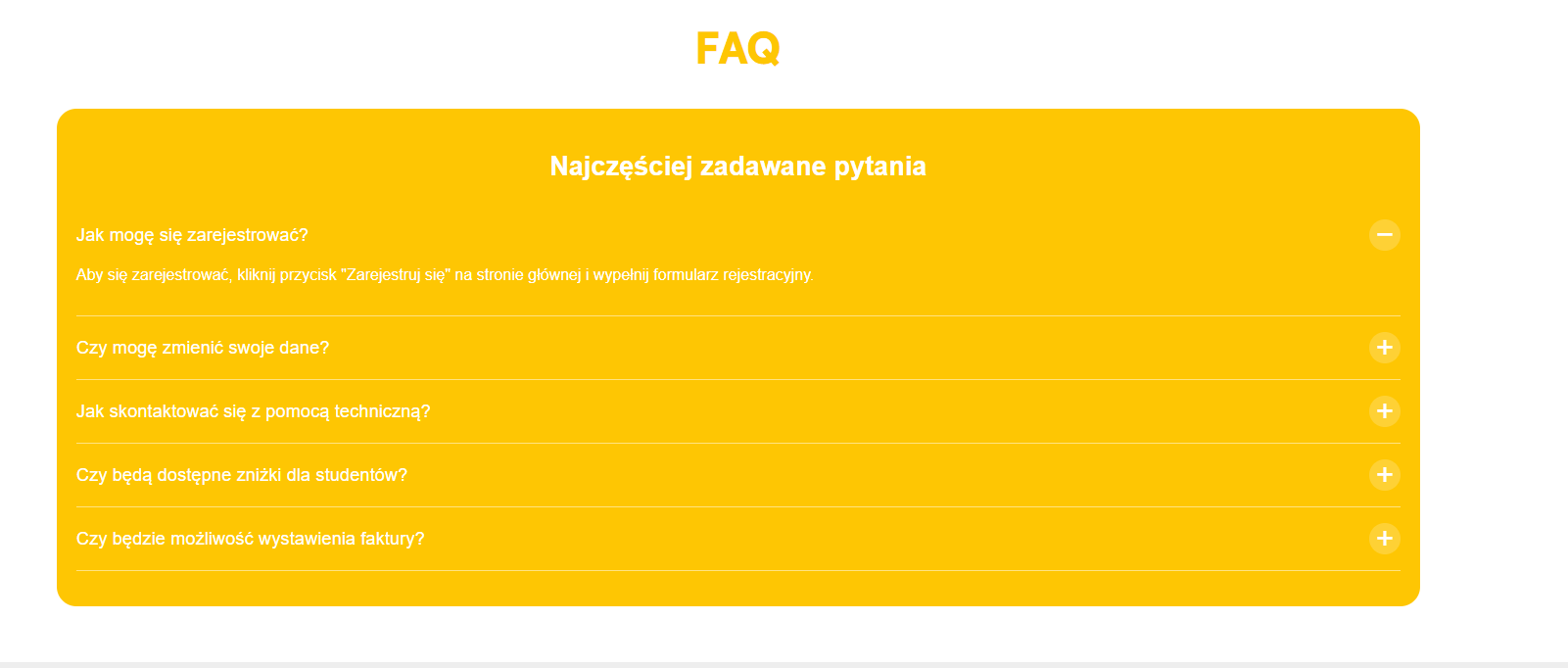
1. Changing the questions and answers
Each question and answer is inside the <li class="faq-item"> tag.
Example:
<div class="faq-question">Jak mogę się zarejestrować?</div>
<div class="faq-answer">
  Aby się zarejestrować, kliknij przycisk "Zarejestruj się" na stronie głównej i wypełnij formularz rejestracyjny.
</div>
To edit:
replace the content of the question in <div class="faq-question">
change the answer inside <div class="faq-answer">
You can also add new questions by copying the whole block <li class="faq-item">...</li> and pasting it below.
2. Changing the section title
The title “Frequently Asked Questions” is in the header <h2>. You can change it to whatever you want:
<h2>Najczęściej zadawane pytania</h2>
3. Changing the text color
The text color is set by:
color: #ffffff;
This setting is at the top of the styles for body, h2, .faq-question and .faq-answer. You can swap it for any color, for example:
#000000 (black)
#333333 (dark gray)
#F5670A (orange)
If you want the questions and answers to be darker (like, on a light background), change color like this:
color: #333333;
4. Change the background color
The background color of the whole FAQ block is set in the .faq-container class:
background-color: #fec603;
Swap this color for another one – for example:
#f0e1c4 – light beige
#ffffff – white
#1a1a1a – dark gray
HTML code to copy:
<!DOCTYPE html>
<html lang="en">
  <head>
    <meta charset="UTF-8" />
    <meta name="viewport" content="width=device-width, initial-scale=1.0" />
    <title>Frequently Asked Questions</title>
    <style>
      body {
        font-family: Arial, sans-serif;
        background: #ffffff;
        color: #ffffff;
        margin: 0;
      }

      .faq-container {
        max-width: 100%;
        margin: 0 auto;
        background: #fff;
        padding: 1.25rem;
        border-radius: 1.25rem;
        background-color: #fec603;
      }

      .faq-item {
        border-bottom: 0.0625rem solid rgba(255, 255, 255, 0.5);
        padding: 1rem 0;
        display: flex;
        flex-direction: column;
        cursor: pointer;
      }

      h2 {
        text-align: center;
        color: #ffffff;
        font-size: 1.7rem;
      }

      .faq-list {
        list-style: none;
        padding: 0;
      }

      .faq-question-row {
        display: flex;
        justify-content: space-between;
        align-items: center;
      }

      .faq-question {
        flex-grow: 1;
        padding-right: 0.625rem;
        font-size: 1.15rem;
      }

      .faq-toggle {
        font-size: 2rem;
        color: #ffffff;
        width: 2rem;
        height: 2rem;
        border-radius: 50%;
        background-color: rgba(255, 255, 255, 0.2);
        display: flex;
        align-items: center;
        justify-content: center;
        line-height: 0;
      }

      .faq-answer {
        padding: 1rem 0;
        display: none;
        color: #ffffff;
        font-size: 1rem;
      }

      .faq-item.active .faq-answer {
        display: block;
      }

      .faq-item.active .faq-toggle::before {
        content: "−";
      }

      .faq-toggle::before {
        content: "+";
      }

      @media (max-width: 480px) {
        h2 {
          font-size: 1.7rem;
        }

        .faq-question {
          font-size: 1.15rem;
        }

        .faq-toggle {
          font-size: 1.75rem;
        }
      }
    </style>
  </head>
  <body>
    <div class="faq-container">
      <h2>Frequently Asked Questions</h2>
      <ul class="faq-list">
        <li class="faq-item">
          <div class="faq-question-row">
            <div class="faq-question">How can I sign up?</div>
            <span class="faq-toggle"></span>
          </div>
          <div class="faq-answer">
            To sign up, just click the "Sign Up" button on the homepage and fill out the registration form.
          </div>
        </li>
        <li class="faq-item">
          <div class="faq-question-row">
            <div class="faq-question">Can I change my information?</div>
            <span class="faq-toggle"></span>
          </div>
          <div class="faq-answer">
            Yep, you can edit your info in account settings after you log in.
          </div>
        </li>
        <li class="faq-item">
          <div class="faq-question-row">
            <div class="faq-question">
              How do I contact technical support?
            </div>
            <span class="faq-toggle"></span>
          </div>
          <div class="faq-answer">
            You can reach our support team by using the contact form on the "Contact" page or by sending an email to [email protected].
          </div>
        </li>
        <li class="faq-item">
          <div class="faq-question-row">
            <div class="faq-question">
              Will there be student discounts available?
            </div>
            <span class="faq-toggle"></span>
          </div>
          <div class="faq-answer">
            Yes, there are special discounts for students. You’ll find all the details about discounts on the tickets page.
          </div>
        </li>
        <li class="faq-item">
          <div class="faq-question-row">
            <div class="faq-question">
              Will it be possible to get an invoice?
            </div>
            <span class="faq-toggle"></span>
          </div>
          <div class="faq-answer">
            Yes, you’ll be able to enter invoice details when buying your ticket.
          </div>
        </li>
      </ul>
    </div>

    <script>
      document.querySelectorAll(".faq-item").forEach((item) => {
        item.addEventListener("click", () => {
          item.classList.toggle("active");
        });
      });
    </script>
  </body>
</html>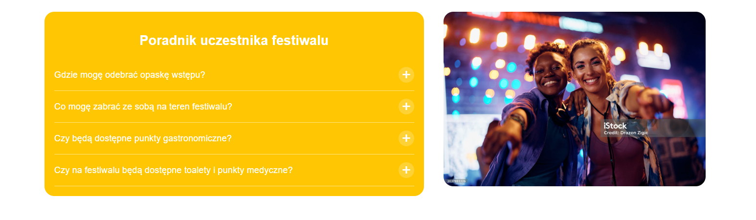
The questions and answers content is inside the <ul class="guide-list">.
Each question is a <div class="guide-question">, and the answer is just below it in <div class="guide-answer">.
Example:
<div class="guide-question">Gdzie mogę odebrać opaskę wstępu?</div>
<div class="guide-answer">
  Opaski wstępu można odebrać w punkcie akredytacyjnym przy wejściu...
</div>
You can change:
questions (e.g. for “Where can I find the festival map?”)
answers (e.g. “Maps will be available at the info point and in the mobile app.”)
To add a new question, copy the whole block <li class="guide-item">...</li> and paste it below, changing its content.
The title of the header is in the <h2> tag:
<h2>Poradnik uczestnika festiwalu</h2>
Just change the text inside, for example to:
“Key info”
“Useful tips for participants”
The image is inside the <img> element inside the container .guide-image.
Example:
<imgsrc="https://media.istockphoto.com/id/2037883326/pl/zdj%C4%99cie/do%C5%82%C4%85cz-do-nas-na-festiwalu-muzycznym-tego-lata.jpg"alt="Obrazek"
/>
You can change:
the src attribute – paste a new link to your photo
the alt attribute – type a description for your new photo, e.g. "View of a festival stage"
The background color of the question block is set in the class .guide-container:
background: #fec603;You can swap #fec603 for any color:
HEX code, for example #222831
RGB, for example rgb(255, 0, 0)
named color, for example darkblue, lightgray
The text color is set in a lot of places as:
color: #ffffff;It controls:
header color (<h2>)
questions and answers
plus/minus icons (.guide-toggle)
You can swap #ffffff (white) for another color, e.g.:
#333333 (dark gray)
black
#00ADB5 (turquoise)
HTML code to copy:
<!DOCTYPE html>
<html lang="pl">
  <head>
    <meta charset="UTF-8" />
    <meta name="viewport" content="width=device-width, initial-scale=1.0" />
    <title>Frequently Asked Questions</title>
    <style>
            body {
              font-family: Arial, sans-serif;
              background: #ffffff;
              color: #ffffff;
              margin: 0;
              padding: 1.25rem;
            }

            .layout {
              display: flex;
              justify-content: center;
              align-items: flex-start;
              gap: 2.5rem;
              flex-wrap: wrap;
              width: 100%;
            }

            .guide-container {
              flex: 1 1 31.25rem;
              background: #fec603;
              padding: 1.25rem;
              border-radius: 1.25rem;
              width: 50%;
            }

            h2 {
              text-align: center;
              color: #ffffff;
              font-size: 1.7rem;
            }

            .guide-list {
              list-style: none;
              padding: 0;
              margin: 0;
            }

            .guide-item {
              border-bottom: 0.0625rem solid rgba(255, 255, 255, 0.5);
              padding: 1rem 0;
              display: flex;
              flex-direction: column;
              cursor: pointer;
            }

            .guide-question-row {
              display: flex;
              justify-content: space-between;
              align-items: center;
            }

            .guide-question {
              flex-grow: 1;
              padding-right: 0.625rem;
              font-size: 1.15rem;
            }

            .guide-toggle {
              font-size: 2rem;
              color: #ffffff;
              width: 2rem;
              height: 2rem;
              border-radius: 50%;
              background-color: rgba(255, 255, 255, 0.2);
              display: flex;
              align-items: center;
              justify-content: center;
              line-height: 0;
            }

            .guide-answer {
              padding: 1rem 0;
              display: none;
              color: #ffffff;
              font-size: 1rem;
            }

            .guide-item.active .guide-answer {
              display: block;
            }

            .guide-item.active .guide-toggle::before {
              content: "−";
            }

            .guide-toggle::before {
              content: "+";
            }

            .guide-image {
              flex: 1 1 300px;
              max-width: 40%;
              height: auto;
              border-radius: 1.25rem;
              overflow: hidden;
            }

            .guide-image img {
              width: 100%;
              height: auto;
              display: block;
              border-radius: 1.25rem;
              object-fit: cover;
            }


      @media (max-width: 480px) {
        h2 {
          font-size: 1.7rem;
        }

        .guide-question {
          font-size: 1.15rem;
        }

        .guide-toggle {
          font-size: 1.75rem;
        }
      }

            @media (max-width: 900px) {
        .layout {
          flex-direction: column;
          align-items: stretch;
          padding: 0;
          gap: 1.25rem;
        }

        .guide-container {
          width: 100%;
          flex: none;
          padding: 1.25rem;
          box-sizing: border-box;
        }

        .guide-image {
          display: none;
        }

        h2 {
          font-size: 1.5rem;
        }

        .guide-question {
          font-size: 1rem;
        }

        .guide-answer {
          font-size: 0.95rem;
        }

        body {
          padding: 0.625rem;
        }
      }
    </style>
  </head>
  <body>
    <div class="layout">
      <div class="guide-container">
        <h2>Festival Goer’s Guide</h2>
        <ul class="guide-list">
          <li class="guide-item">
            <div class="guide-question-row">
              <div class="guide-question">Where can I pick up my entry wristband?</div>
              <span class="guide-toggle"></span>
            </div>
            <div class="guide-answer">
              You can pick up your entry wristband at the accreditation point by the festival entrance. Just show your ticket and ID.
            </div>
          </li>
          <li class="guide-item">
            <div class="guide-question-row">
              <div class="guide-question">
                What can I bring to the festival grounds?
              </div>
              <span class="guide-toggle"></span>
            </div>
            <div class="guide-answer">
              You can bring a small backpack, a water bottle (0.5l, plastic, without a cap), a picnic blanket, and a power bank. Dangerous items aren’t allowed.
            </div>
          </li>
          <li class="guide-item">
            <div class="guide-question-row">
              <div class="guide-question">
                Will there be food stalls available?
              </div>
              <span class="guide-toggle"></span>
            </div>
            <div class="guide-answer">
              Yep, there will be food trucks and food zones at the festival offering vegetarian, vegan, and gluten-free dishes.
            </div>
          </li>
          <li class="guide-item">
            <div class="guide-question-row">
              <div class="guide-question">
                Will there be toilets and medical points at the festival?
              </div>
              <span class="guide-toggle"></span>
            </div>
            <div class="guide-answer">
              All around the area you'll find marked portable toilets and first aid points with qualified medical staff.
            </div>
          </li>
        </ul>
      </div>

      <div class="guide-image">
        <img
          src="https://media.istockphoto.com/id/2037883326/pl/zdj%C4%99cie/do%C5%82%C4%85cz-do-nas-na-festiwalu-muzycznym-tego-lata.jpg?s=2048x2048&w=is&k=20&c=280cJFT98RjKPO_73UGlRqiGlPAcoVWSWfXv6rPDKQU="
          alt="Obrazek"
        />
      </div>
    </div>

    <script>
      document.querySelectorAll(".guide-item").forEach((item) => {
        item.addEventListener("click", () => {
          item.classList.toggle("active");
        });
      });
    </script>
  </body>
</html>
The content is inside <p> elements in the .event-info block. For example:
<p>
  <b>Data:</b> 15 grudnia 2024
</p>
You can change:
Titles (<b>Data:</b>, <b>Miejsce:</b>, etc.) – e.g. change to “Date”, “Location”.
Text content after the colon – e.g. a new date, time, or event description.
The heading is in the <h3> tag:
<h3>Informacje o wydarzeniu</h3>Just change the text inside, e.g. to "Event details" or any title you want.
In the <style> section, find:
color: #F5670A;This color is used for:
title (<h3>)
event info (class .event-info)
You can swap #F5670A for any other color in the format:
HEX code, e.g. #008080
RGB, e.g. rgb(255, 0, 0)
named, e.g. black, darkblue
This is what controls the background of the whole block:
background-color: #f0e1c4;Inside the class .event-info-container. Change the color just like above – to a different code or color name.
HTML code to copy:
 <!DOCTYPE html>
<html lang="en">
  <head>
    <meta charset="UTF-8" />
    <meta name="viewport" content="width=device-width, initial-scale=1.0" />
    <title>Event information</title>
    <style>
      body {
        font-family: Arial, sans-serif;
        background: #ffffff;
        color: #ffffff;
        margin: 0;
      }

      .event-info-container {
        max-width: 100%;
        margin: 1.25rem auto;
        background: #fff;
        padding: 1.25rem;
        border-radius: 1.25rem;
        background-color: #f0e1c4;
      }

      h3 {
        text-align: center;
        color: #F5670A;
        font-size: 1.7rem;
      }

      .event-info {
        color: #F5670A;
        font-size: 1rem;
        line-height: 1.6;
      }
    </style>
  </head>
  <body>
    <div class="event-info-container">
      <h3>Event information</h3>
      <div class="event-info">
        <p>
          <b>Date:</b> December 15, 2024
        </p>
        <p>
          <b>Place:</b> Sports and Entertainment Hall, ul. Przykładowa 123, Warsaw
        </p>
        <p>
          <b>Hours:</b> 10:00 AM - 6:00 PM
        </p>
        <p>
          <b>Description:</b> Join us for an unforgettable event! You can look forward to expert lectures, hands-on workshops, and lots of attractions. It's a perfect chance to make new connections and gain valuable knowledge. Don't miss this opportunity!
        </p>
          <p>
          <b>Organizer:</b> Code Academy
        </p>
      </div>
    </div>
  </body>
</html>