A widget is a ready-made piece of code that you copy from the admin panel and paste on your website. It lets you display data from the Meeting Application system (agenda, speakers, or exhibitors) directly on your site.
The most important benefit: You keep all content in one place (Meeting Application Panel), and changes are automatically pushed to:
The Landing Page in Meeting Application,
The event’s mobile app,
Your external website (by using the widget).
iFrame is a “page in a frame” (you embed a whole external view as a separate entity).
Widget is a component that loads via a script and renders a specific function (e.g. a list of speakers) without pasting an entire page in a frame.
A widget usually:
fits better to the layout of the page (responsiveness),
gives you more control over parameters (e.g. number of items per page),
can be easier to style.
Each widget consists of two elements:
Script (<script>) – Adds the widget functionality. We recommend pasting it into the <head> section of the page.
Widget tag (<meeting-app-...>) – You paste it in the <body> section, exactly where the module should appear.
To move on to widget configuration, you need to add the agenda, speakers, or exhibitors module to your event. Then, in the PERSONALIZATION tab, you can adjust the widget and copy the ready code to paste it into your own website.
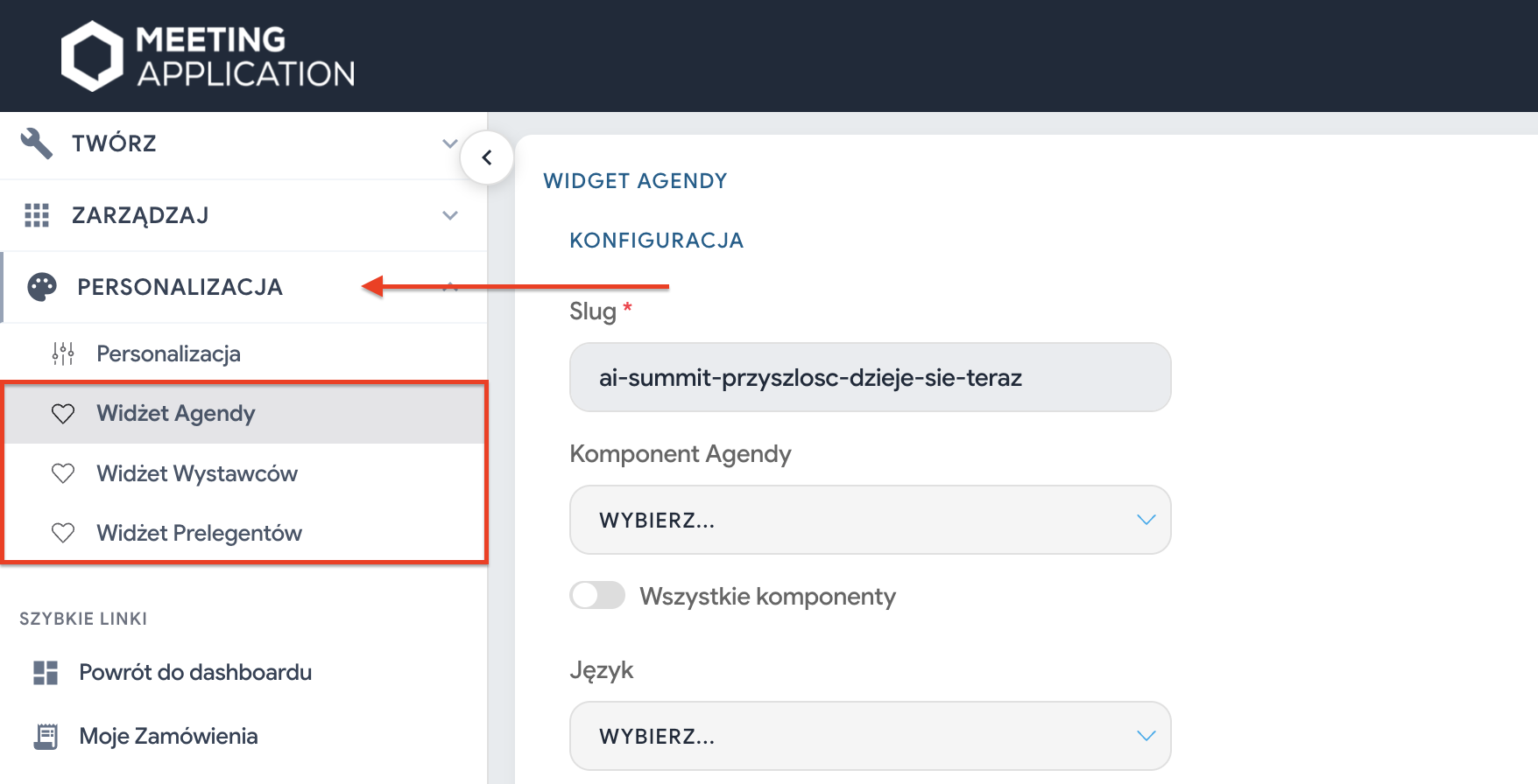
You configure widgets with sliders and fields in the panel (left column). Every change updates the generated code (right column).
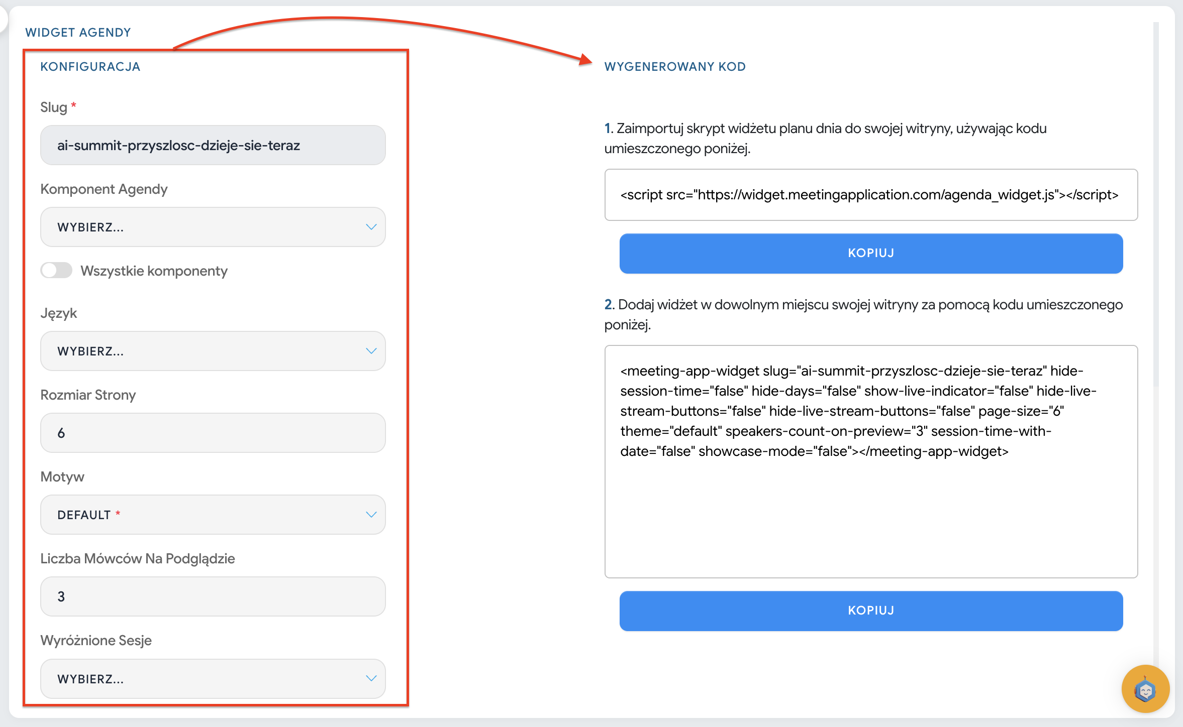
After leaving and re-entering the widget, the configuration settings are reset. The system doesn’t remember your choices in the generator.
What this means in practice:
if you fine-tune the configuration (e.g. hiding hours, page size, LP mode) — copy the ready code and keep it on your side (e.g. in a file / document / notes),
if you want to change the widget’s “behavior” (e.g. toggles), then generate the code again and replace it on the page.
Displays the daily schedule / sessions from your agenda, with filtering and display options (depending on the configuration).
Slug – event identifier (must match the event).
Agenda Component / All components – you choose which agenda component it should pull data from, or whether it should take all of them.
Language – widget language.
Page size – how many items are shown on one page.
Theme – appearance (e.g. default).
Number of speakers in preview – how many speakers should be shown with the session in the preview.
Featured sessions – option to indicate sessions that should be promoted.
Agenda track tags – filtering by tracks.
Hide session time
Hide days
Show live indicator
Hide live broadcast buttons
Session time with date
Presentation mode
Each of these toggles translates into attributes in the code (e.g. hide-session-time, hide-days, show-live-indicator etc.).
This field lets you add your own CSS rules, e.g. change the background, font size, rounding. Example from the screenshots:
.class-styles {
  background-color: #ffffff;
  font-size: 20px;
}
.class-styles-th2 {
  border-radius: 12px;
}

you can change the background color in the embedded code (on the website side),
or use the Custom CSS styles field in the panel (Landing Page → Widgets) and enter the CSS rules there.
What does the Exhibitors widget show?
Information pulled from the BUSINESS HUB module, with pagination.
Basic configuration (left side)
Slug – event identifier.
Exhibitor Component – choice of data source (e.g. BUSINESS HUB).
Language – language selection.
Page size – number of exhibitors per page.
Theme – e.g. default.
LP mode – display mode switch (in the screenshot as lp-mode in the code).
Custom CSS styles – optional styling.
At the bottom of every configurator you’ll find a field for your own CSS code. This lets you deeply tweak the look (e.g. change the shape of buttons or the background). Example:
.class-styles {
  background-color: #ffffff;
  font-size: 20px;
}Shows a list of speakers assigned to the selected component, with pagination (by page size).
Slug – event identifier.
Speakers Component – component selection (e.g. SPEAKERS).
Language (in the screenshot described as speakers_widget.lang) – language selection.
Page size – number of speakers per page.
Custom CSS styles – same as above, for styling.
For the speakers widget you can additionally control the appearance through attributes in the tag: m.in. language, colors (HEX) and font from the Google Fonts library.
Speakers widget - quick guide
Available parameters include m.in.:
locale
main-color, accent-color
background-color
primary-text-color, secondary-text-color
font (font name exactly as in Google Fonts)
Speakers widget - quick guide
Example (in line with the technical document):
<meeting-app-speakers
  slug="twoj-slug-wydarzenia"
  component-id="123"
  page-size="6"
  locale="pl"
  main-color="#4A90E2"
  accent-color="#F5A623"
  background-color="#FFFFFF"
  primary-text-color="#333333"
  secondary-text-color="#777777"
  font="Montserrat"
></meeting-app-speakers>

We changed the agenda/speakers in the panel. Will it also change on the website?”
Yes — if the widget is embedded, then the content updates based on the data from the panel.
“I want to hide the times / change the number of items / turn on the LIVE indicator — will that also update automatically?”
Not always. These are widget settings saved in the code as attributes. If you change them in the generator, you need to:
generate the code again,
paste the updated code on your website.
“Why did the settings disappear after opening the widget?”
Because the generator doesn’t save the configuration. That’s how it normally works: you set it up → copy → paste on your website → keep the code on your side.
“The widget doesn’t show up”
Most common reasons:
the script is missing (step 1) or it’s pasted in the wrong place,
the slug or component-id are incorrect,
your site/IT is blocking external scripts (security policies, plugins, restrictions).
Meeting Application doesn’t implement the widget on your website
We provide the generator and the code. Embedding the widget on your website is up to you (or your webmaster / IT team).
Configuration changes the code: Every change of the slider on the left side of the panel updates the code on the right.
The generator doesn’t save settings: After refreshing the page, the settings in the generator (e.g. selected colors or page size) will go back to default. Always copy and save the generated code in your notes. * The event must be Published: If your event has the "Draft" status, the widget won’t display any data.
Self-implementation: Meeting Application provides the code, but pasting it into your website is the responsibility of your IT team or webmaster.